

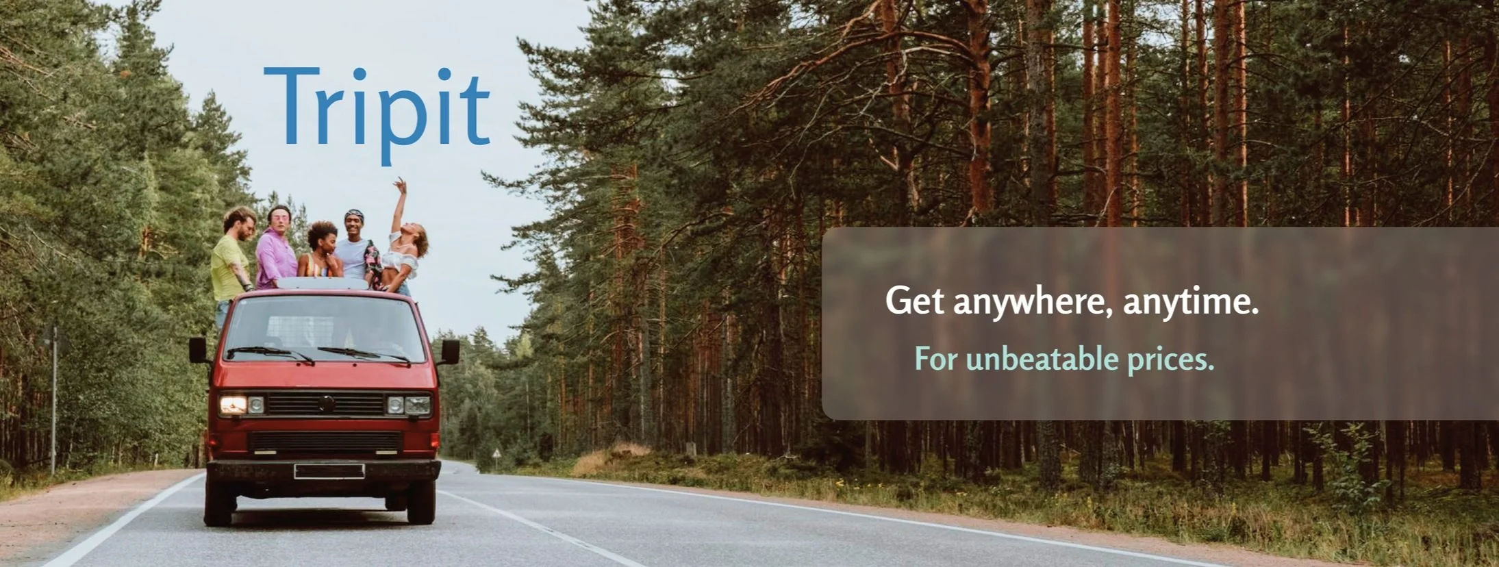
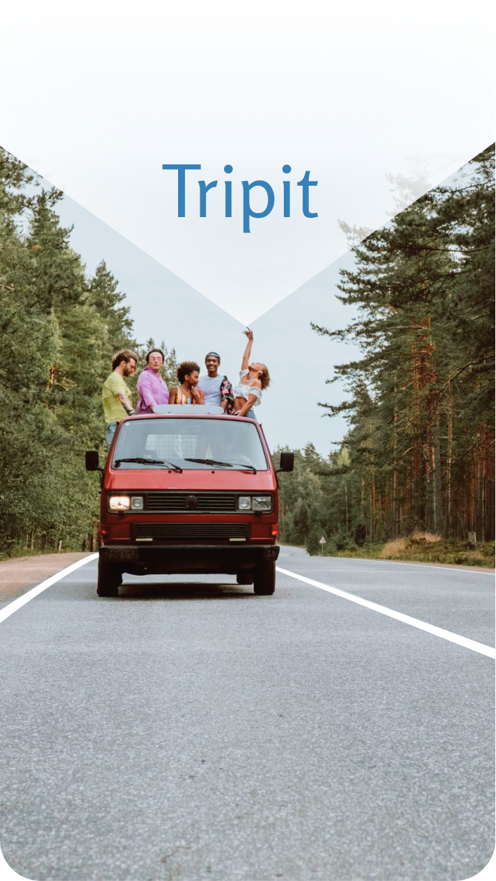
Tripit
An End to End App
Background
Countries in Europe have mainstream car services that allow their citizens the flexibility of travel that Americans are missing. Distances are much larger in the states and the road trip spirit thrives, yet there are many people without cars and many without sufficient funds to travel. Having the option of ride-share with competitive prices and flexibility of booking will democratize travel for Americans.
Problem
There isn’t a good, cheap and trusted way to get around by car between states, so people resort to more expensive means of transportation, and thus the process of interstate travel is hectic.
Solution
Create an interstate ride-share service that provides flexibility of travel for its users for the best prices on the market.
Research
Market Research | Competitive Analysis | User Interviews
Research Goal
Understand what makes for the optimal travel experience for users. What they are missing in their travel transport needs and if ‘Tripit’ solves that problem for them.
Research Objectives
Find out what means of transport do users turn to for interstate travel.
Address possible concerns users have with their means of transportation.
Understand users’ traveling limitations and needs.
Look into business competitors in the industry and find weak points.
Investigate whether there is enough of a market for this application.
Structure a business model that would bring revenue while providing competitive prices for its users.
Understand how to build trust with users and keep users safe with this service.
Assumptions
Users want to have the option to travel by car longer distances than they can with the existing car services.
Users are interested in cheaper transport options.
Users are open to sharing a ride in a trusted environment.
Users trust reviews and background checks.
Users are proficient with their mobile phones.
Users are open to driving others to make extra money on their trips.
Users want flexible travel options.
Users enjoy or at the very least don’t mind a social aspect in their travels.
Methodologies
Competitor analysis - helps get a sense of what works currently in the market and what doesn’t.
User interviews - get a better understanding of the user through questions and conversation.
Co-Discovery - having the interview with a relative or friend makes for a relaxed and genuine discussion.
Usability testing - helps to see how clients navigate the website and make adjustments from there.
I began my research with articles from car newsletters, travel blogs, tech blogs, public forums on ride share, facebook groups for carpooling, vacation exchanges and desired transport options. I looked into what methods of transportation allow for long distance rides, like Amtrak and omio. I made lists of the good features and the negatives of various methods of transport. Looking into it on a market level, I found that there are similar apps in existence that have been successful. This secondary research provided me with sufficient data to reassure me that I can proceed with making the app.
Competitive Analysis
Direct Competitor Indirect Competitors
It exceeds expectations. The main achievement in the app is that you can search for any dates that you need to travel and see available journeys posted for those dates. The prices are great, it is easy to communicate with your driver once the trip is booked and it has reviews for absolutely everyone involved.
There are good safety measures such as restriction from exchanging numbers and locations prior to booking a trip. This also is a great business feature that keeps the communication inside the app. The business model is great, allowing for competitive prices for passengers and money for drivers, with Blablacar itself receiving an amount from each transaction. There is a reason it is so widely accepted and highly regarded in Europe.
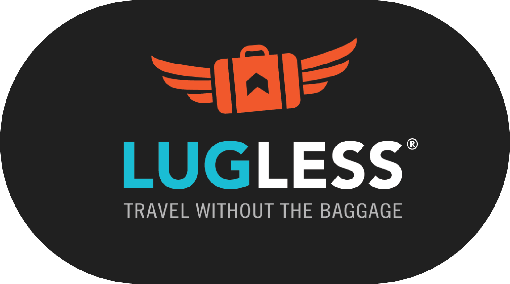
At this point, I started thinking about the additional features I would have loved to see in a long distance driving app and immediately touched upon delivery services. From here it grew to package delivery, then to suitcase delivery and finally to a whole lot of furniture delivery. Essentially, combining the long distance travel with the option to book movers to come and drive your things from place to place. This had a potential clientele, and so I proceeded to compare “Lugless”.
Craigslist is an oldie, but a goodie. Sure, we have come a long way since its creation, yet it still manages to draw crowds of people renting, buying and selling furniture, homes, etc. It even has rideshare.
Secondary Competitors
As for my secondary competitors, they all lacked something crucial to the purpose of Tripit. Each coming close with certain features, yet no cigar. Click down below for my findings on each business’s strengths and weaknesses.
User Interviews
Having collected data on the market of existing businesses along with the traveling trends and patterns, it was time to give the statistics some life. I prepared questions for 5 potential users to get a better understanding of their travel and transportation needs. This helped me see how relevant Tripit would be in the current travel market. The interviews lasted for about 5-15 minutes each, and covered topics such as the importance of direct pick up and drop off, traveling with a substantial luggage and even furniture, and suggestions for Tripit to make the traveling long distance and moving experience more accessible.
Chosen Transport Booking
Here you can view our users most used websites for their traveling needs.
Define
User Personas | Empathy Maps | Project Goals
User Personas
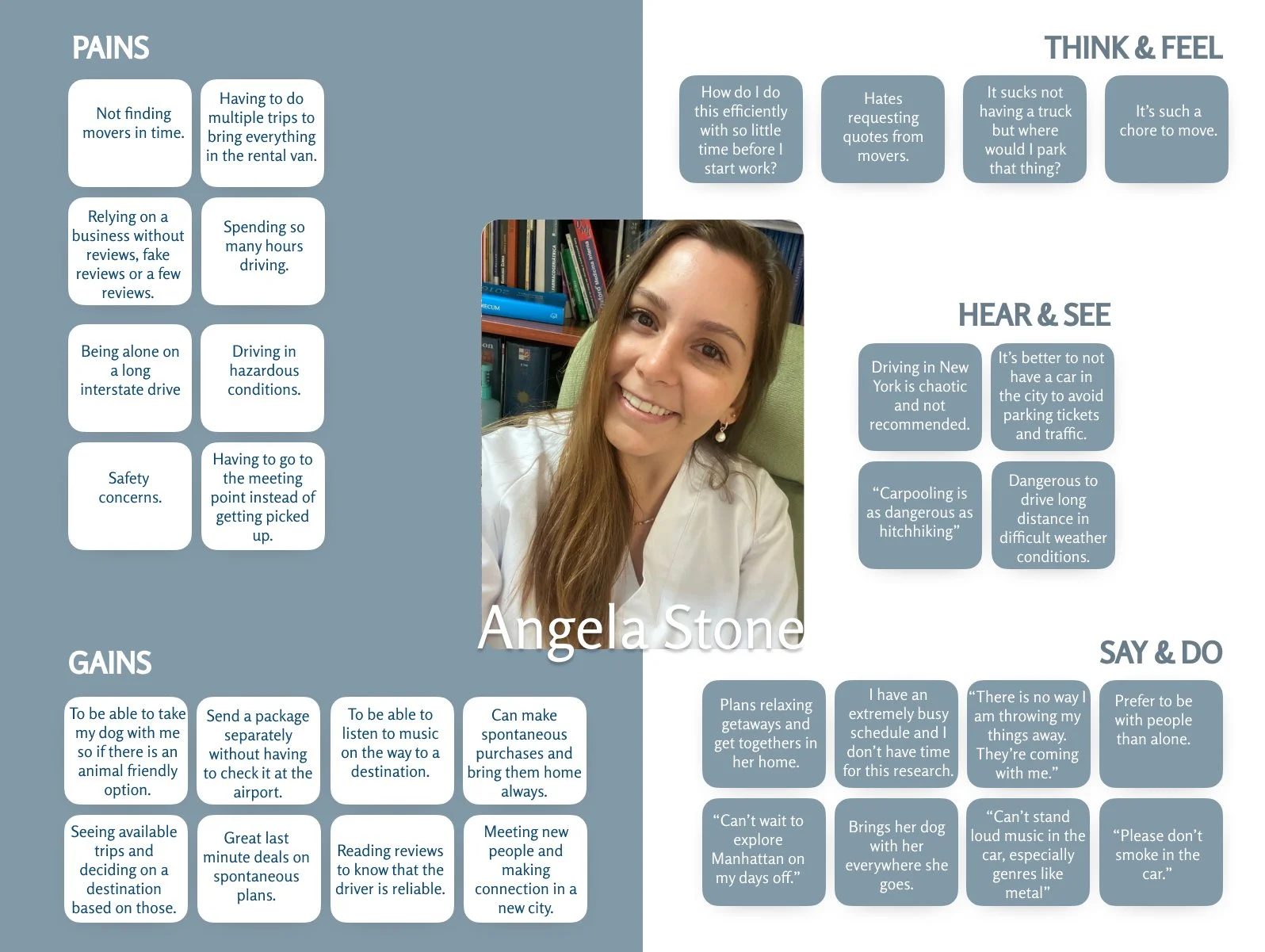
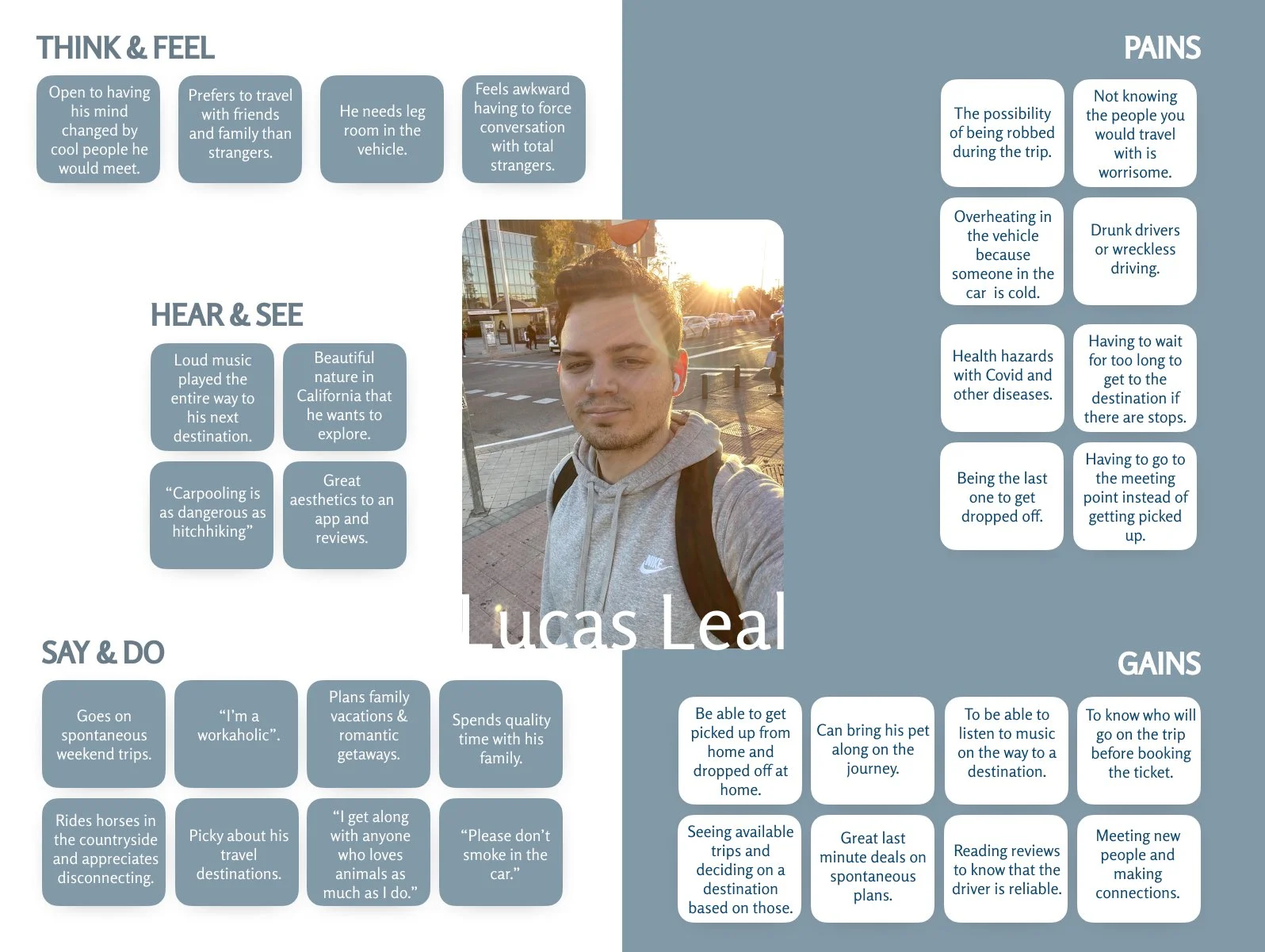
I synthesized the data I collected so far to create two target users for Tripit to become the voice of the users interviewed. Lucas is the guy who got used to not having a car, and wants his premium service door to door. Angela is searching for a way to get from Pittsburgh to Manhattan on short notice using the delivery feature I am debating. Having a visual representation of the personas helps make the data gathered clear and user friendly.


Empathy Maps
To go a step further, I added an empathy map that focuses on sensations, thoughts, vibes and user actions. It’s a way to see the inside workings of our users’ brains. These are based on complaints that I have witnessed in my user interviews and market research. You can click on each image to make it larger.
Project Goals
Tripit would address the concerns we see from our user personas. Concerns such as credibility, safety, comfort and affordability. It comes down to the very foundation of the app. Driving apps in the states do not offer the affordable service of a shared car ride. That is why Tripit would be an intuitive solution. Here are the key features that Tripit would provide:
Profiles with preferences for both drivers and passengers.
Ability to book a ride short notice.
Reviews for drivers and passengers.
A dashboard of all available trips categorized by preferences and user goals.
Disability accommodation.
Direct pickup and dropoff.

Ideate
Feature Roadmap | Sitemap | Task & User Flows
Feature Roadmap
Here you can see the most important features to be added to Tripit under ‘must haves’. It is also worth it to consider adding some of the ‘nice to have’ features because either way there are other applications that would allow clients to do such things as booking a long distance ride so while the nice to have is not essential, it is certainly what will make it stand out. For example, personalization. The personalization of a user’s profile with their preferences will make it more appealing to book a ride with that person. There is a story there and it isn’t just a driver or just a passenger anymore, but rather an opportunity to meet someone who is on the way to the same destination and could become a potential acquaintance, and even friend.

Sitemap
The sitemap consists of the dashboard with the ‘trip request’ area, the ‘delivery’, ‘trips’, ‘publishing’ section and a user ‘account’ area. It is essentially a table of contents for the app, helping to figure out its organization. In the ‘Trips’ section, we can see all of our messages under one option and our trip details with reviews in the other option. Under ‘publish’, we are able to publish a regular trip that we are heading on or a delivery service we are able to provide based on our vehicle and space. Under ‘profile’ we can see the user profile which focuses more on the questionnaire and user preferences, and account that focuses on payments, settings and driver’s registration.

Task Flow
The task flow is a great way to visualize how users would interact with the app. You can find two categories. One is the user action and the other is the page that loads after the user takes the action. It could be to click, to select, to filter and to browse. In this task flow, I walk you through how a user requests a trip and books it.

User Flow
You are now acting on behalf of Lucas Leal, looking through all the local and cross country trip options that are available to book now on Tripit. You are seeing his decision making process - a few detours such as reading up on some driver reviews - and following his steps all the way up to the confirmation email. Lucas needs to book a trip and before booking his most important trip, he is exploring how to use the app.

Design
Sketches | Wireframes | Brand Identity
Low Fidelity Sketches
These are the initial sketches of the screens I had planned on doing to get a good idea of what the app can do for us as users.
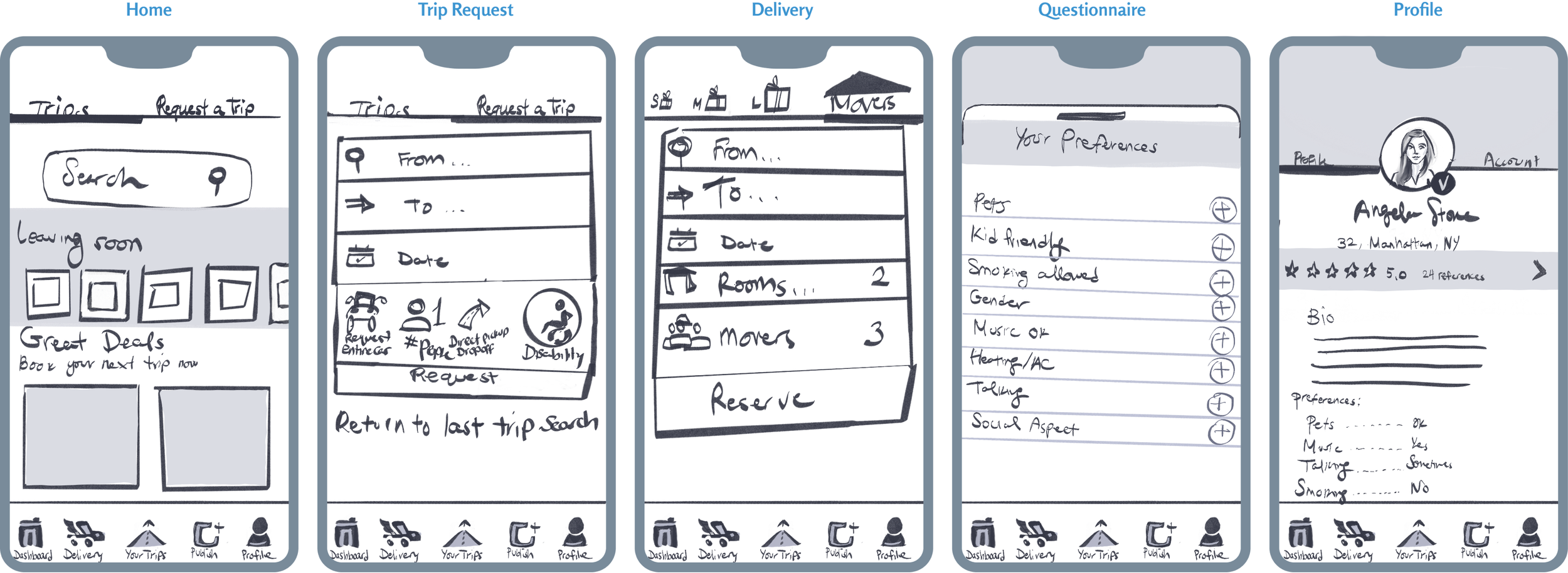
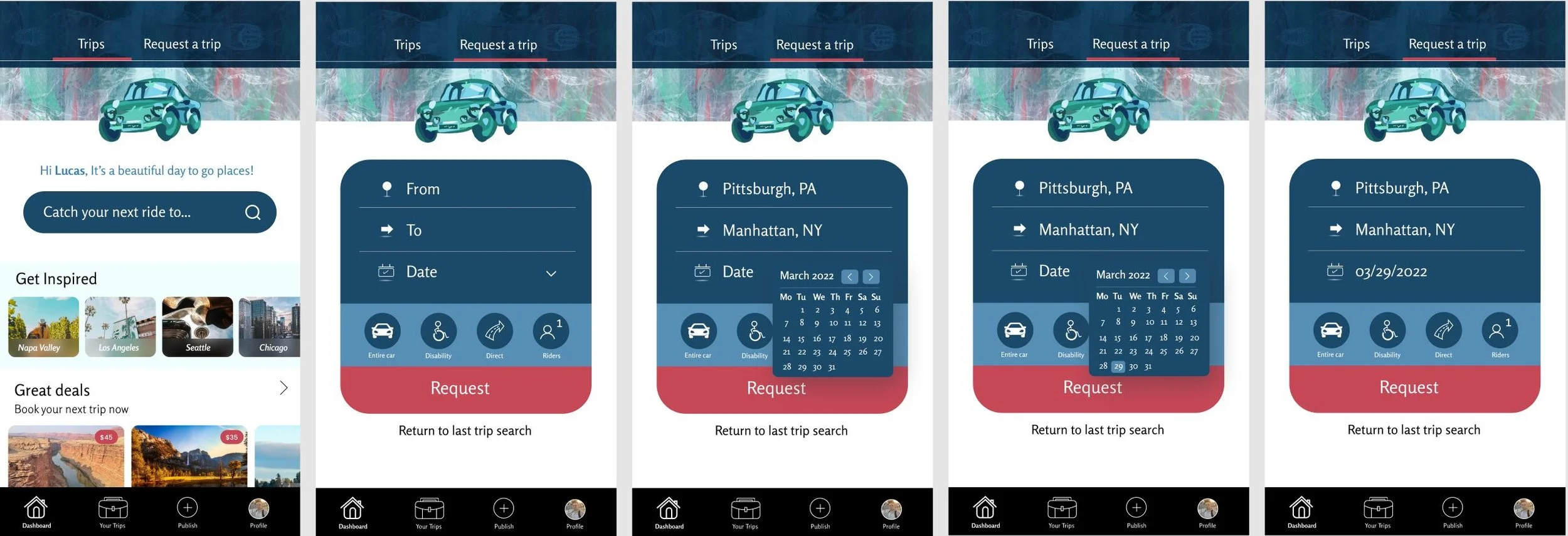
From the dashboard, we can see the trips that are leaving the soonest, to give users the opportunity for a spontaneous easily accessible getaway option. Later. we see the great deals that are available on the app. There are two main categories on our dashboard:
1. One category that allows us to search and explore offered trips without filters.
2. Another category that gives us the option to request a specific trip that we need to do on a certain day.
One thing to remember, we are booking a one way trip so we have the option to be flexible in our trip planning. In the case that it is a restricted time, before booking the way there, we can check what dates are available for trips back from our desired destination.
At this point in time, I am still contemplating the look of a delivery service within the app so the next screen is the delivery with its own menu option for a clear division of purpose. Here, I decided to have people choose their amount to move the traditional way that moving companies do it - by rooms. Clients have the option to request the amount of movers necessary as when the movers register their accounts, they provide their number of available movers for service requests.
Next, we have our preferences questionnaire that helps both drivers and passengers get matched with the kind of experience that they want to have during their ride. As some people prefer not to talk or have music playing and just want to take a nap, they can be matched with drivers who are not feeling social during their drive and just want to get to their destination with some expenses covered. Likewise, people who want to make plans with others and have a social experience can be matched with others with the same wishes.
The last screen is the user’s profile with all of their preferences, bio and reviews.
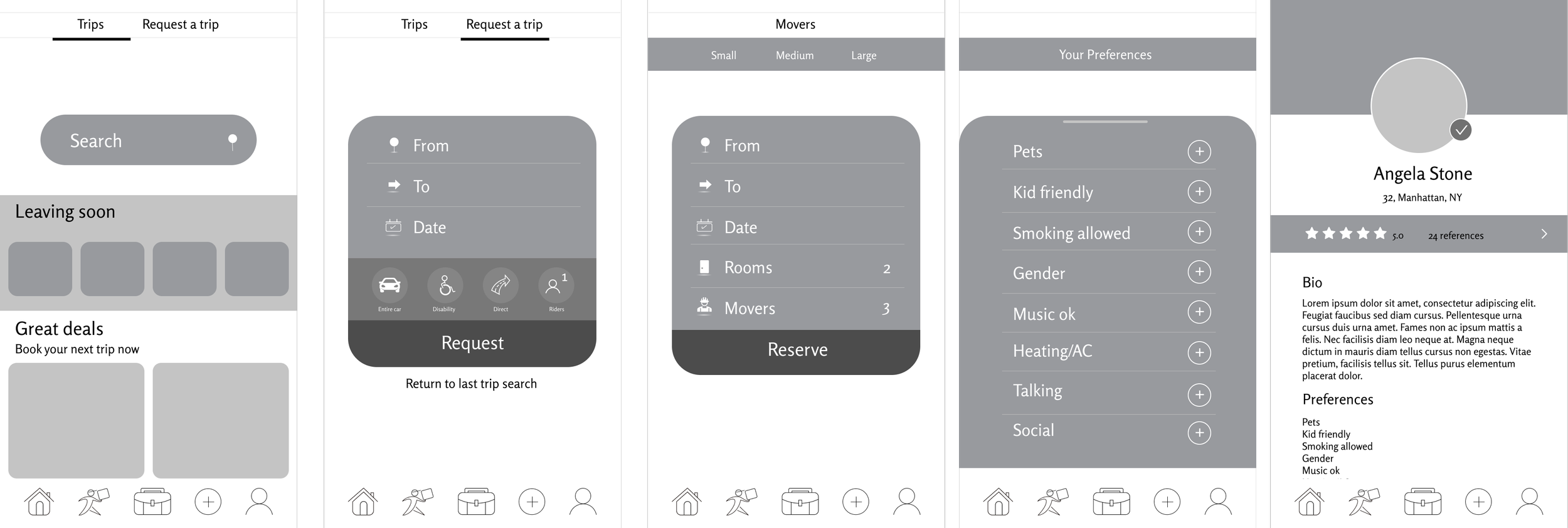
Mid-Fidelity Wireframes
The mid-fidelity wireframes are the first look at the digitized project. It is as blueprints are to architects. Here, I got a better sense of my shapes and measurements. I changed up my icons and cleaned the mess that was the previous delivery request top menu. In this version it felt clean, yet it was missing character and didn’t have much to make it stand out.
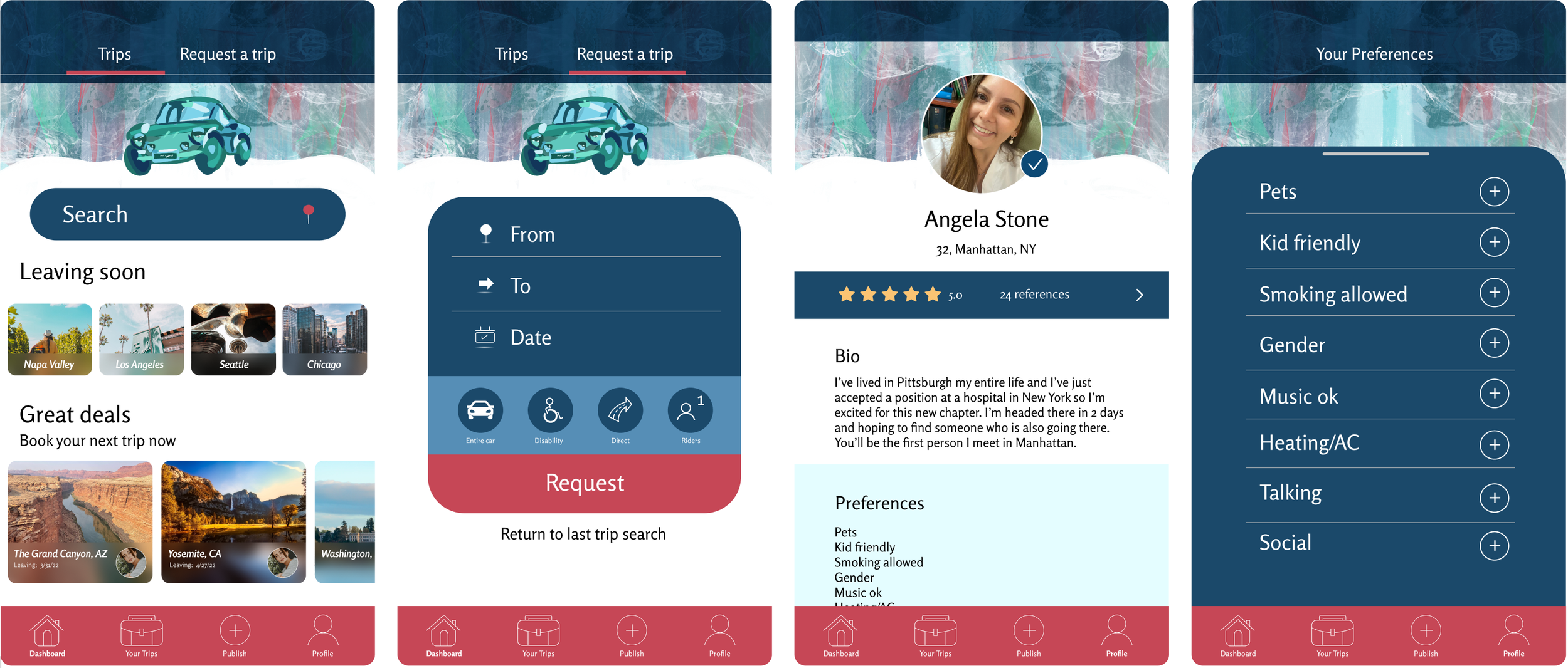
High Fidelity Wireframes
In this version, I was able to begin to apply all of my research to the design of the app. I wanted something fresh, straightforward, fun and modern. I asked as many testers as I could what are the associations that they have with each one of those words and some of the answers were:
Fresh- Mint, blue, clean, white, marble floors, fresh paint, new wheels, car wash.
Straightforward- Road, direct, easy to understand, clear, intuitive, easy to use, accessibility.
Fun- Patterns, illustrations, quirky, pink, playful, interactive, fun to use, fun to do.
Modern- Minimalistic, circular, apple, mac, big screen, interactive, video games, large scale.
Brand Identity
So much of what makes an app successful is branding. The way it is marketed could either promote the business to thrive or let it spiral. The good thing about Tripit is that it is self revealing, so not much is needed to convey that it is a company that helps you get from place to place. I wanted to be consistent with the word associations from the people I interviewed. That’s why the logo is minimal, the photo conveys the app’s superpower of bringing people together to go places faster for cheaper and with comfort. At this point with my mentor’s feedback, I had realized that the delivery portion is not the main focus of the app. With it being a great hit in the user interviews, it is certain that it is needed, but not to the extent that a rideshare app like Tripit is. That is why it would be a good idea to move the delivery aspect of the app to the delightful additions that would come later on.
UI
Mood board | Style Tile
Mood Board
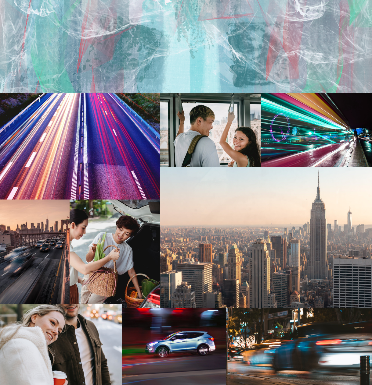
Through the mood board, you can see the images I referenced to help me create the marble top pattern that I used for the header in the app. A lot of it came from car motion photos in the dark. The marble pattern came from the association words for fresh and so did the colors. Shades of minty blue with a bit of green and red for the stoplights. I tried to make it as obvious as possible to follow the straightforward association. To convey minimalism, I focused on people being together and helping each other. In essence, the app idea is minimalistic. There is no flare or premium service, just the essential car travel commodities and so I wanted to show it through the few people’s photos. Last but not least, the fast pace of cities and lights to accompany the modern aspect of the app. I needed to bring it all together and the thing that made sense most is to add an illustration.
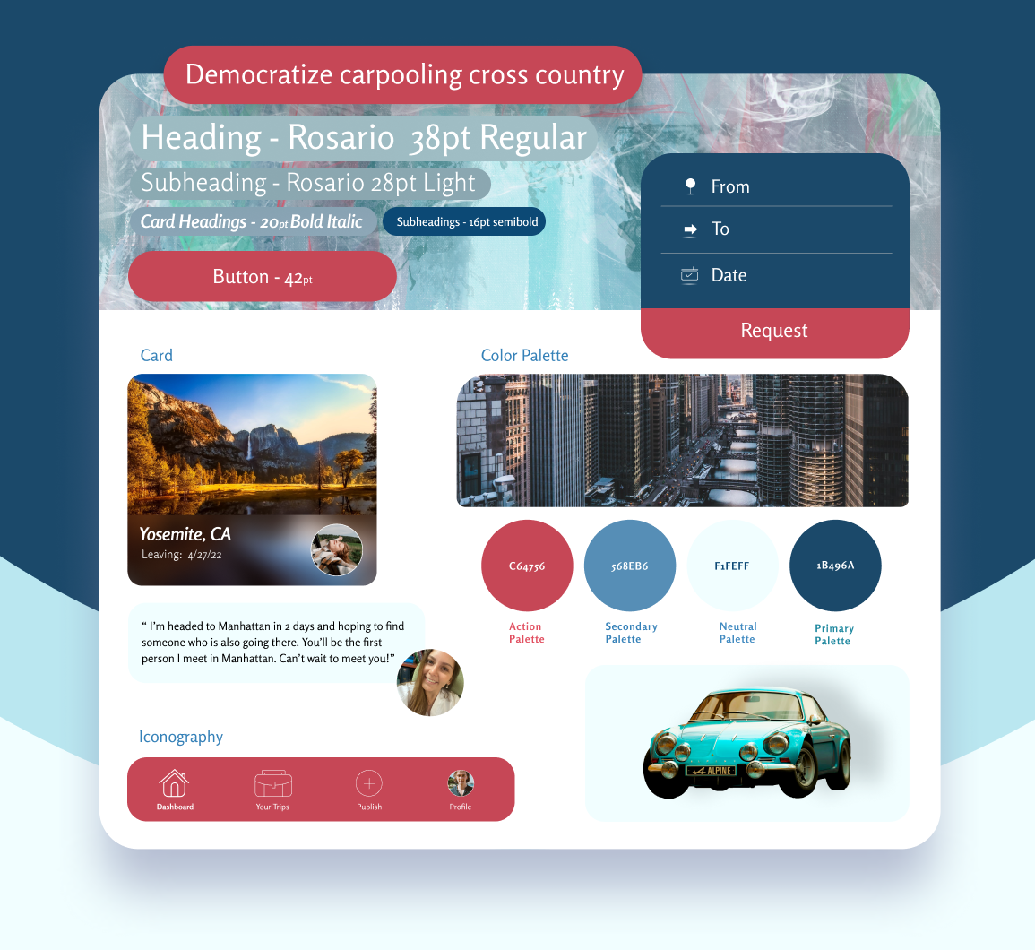
Style Tile
A style tile is presented in the same way that a construction tile is presented to a client in a home remodeling business. The client receives tile samples of flooring and walls, swatches of upholstery materials and all kinds of catalogs. A UI style tile holds all of its building materials on one tile: the font, color palette, cards, imagery and iconography.
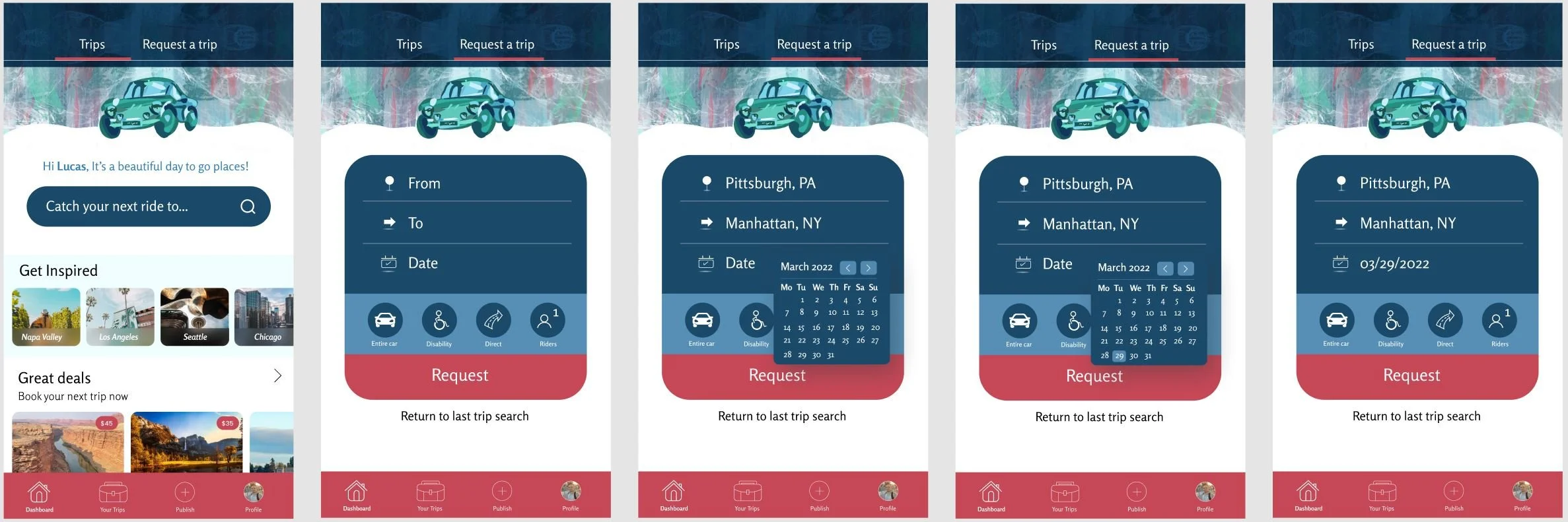
Prototypes
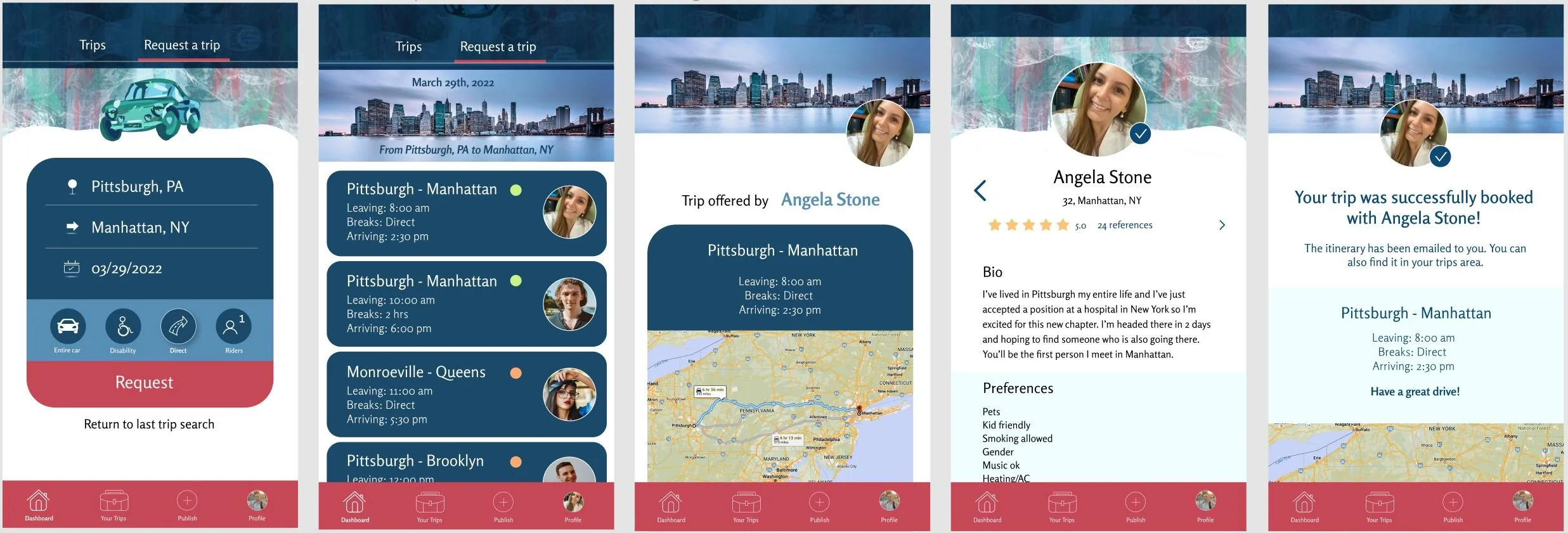
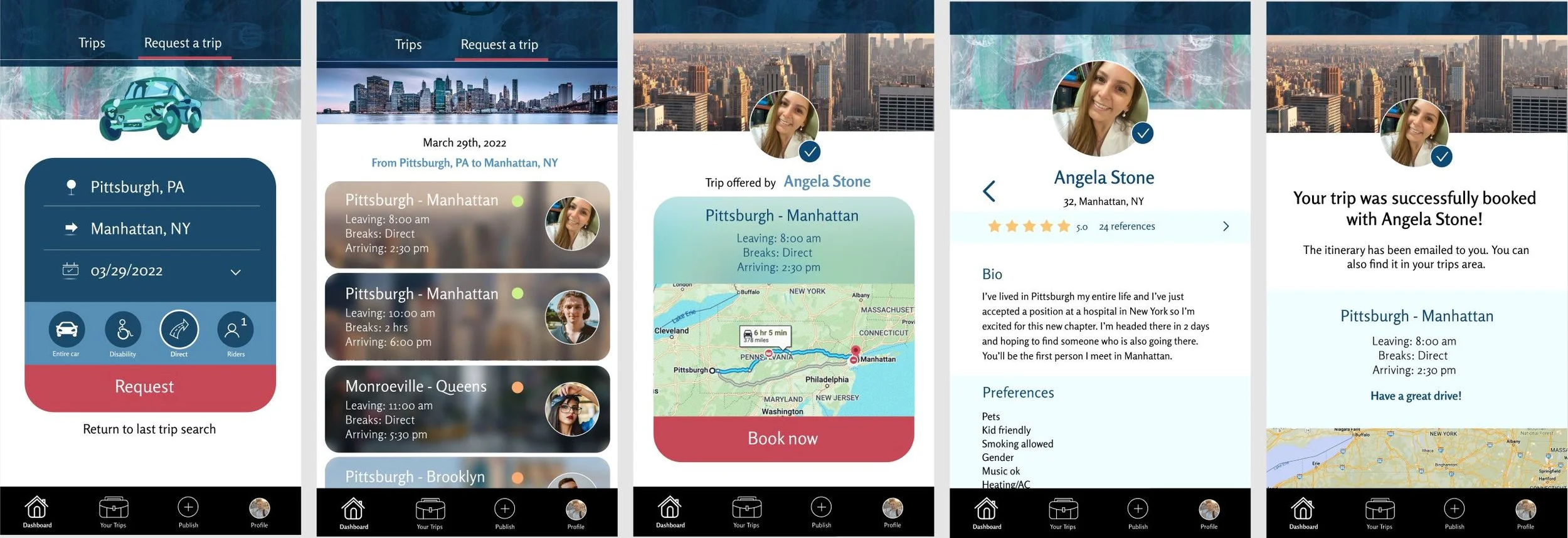
User Lucas Leal stumbling upon Angela Stone’s published trip.
Here, just as in the task flow, we follow along as Lucas searches for a trip from Pittsburgh to Manhattan. He chooses to go specifically on the 29th of March and happens to find Angela’s recent post. He looks at her profile and books the trip, receiving a confirmation screen.
Testing
Usability Testing | Affinity Map
Usability Testing
1.Test objectives
Understand the user’s thought process and needs when it comes to signing up for local rides and long distance trips.
If users understands the purpose of Tripit.
Are the interactions intuitive.
Does the app address all questions a user might have about the services.
Is Tripit familiar & easy to use.
2. Test subject
High fidelity prototype - app.
3. Test methodology
Participants will follow instructions to navigate the prototype for the landing page, roommates page, loan page and community page.
4. Participants
Have carpooled in the past or thought about it.
Want to leave the house to go places.
5. Recruitment plan
In person & video interviews.
6. Script procedure
Introducing Tripit briefly.
Explain the users that they need to find Angela Stone’s published ride, see her profile and then book her ride.
Ask users to voice their thoughts throughout the process.
7. Test goals
Users understand the purpose of Tripit.
Users can easily find the ‘request a trip’ option.
Users want to sign up.
Users are sure their ride has been booked and know what to do afterward.
8. Test completion rate (% of tasks completed)
100%
9. Error-free rate (% of tasks completed without errors)
100%
Affinity Map
Here is the feedback I received after my usability testing interviews:

The car illustration is very unique and gives the app character.
Tripit is a suitable name.
Lovely, uplifting colors.
It looks really modern.
Love the shapes of the boxes. It gives off positive vibes.
Really great background that fits with the color scheme.
Good, clear buttons.
I love that you specified that you can actually click on the reviews and see what people say about the driver. That’s a great addition.
I love the social option where you can go along with people’s planned trip.
It’s easy to understand.
I like the pattern in the top strip. It’s almost a rainy reflection of the illustration.
The calendar is nice and minimalistic.
Love the house icon.
I like that I have the option to return to my last search if it clicked out on accident without having to pick those again.

Maybe make the background straight instead of a regal wave of sort
I don’t know how I feel about her profile photo being on the right side in the 7th screen.
The colors are a bit distracting.
Maybe try a photo of a car instead.
The calendar is missing an arrow down.
When you click the direct route option, it’s hard to see that it’s selected.
The profile page feels boring. It needs something extra.
Change the font for numbers. They’re too skewed.
The text on the photo does not look good in the 6th screen.
There's lots of color - I'm not 100% sure where to look.
I feel like I want to see more of the glass effect in other screens and I only saw it at the dashboard.
Improvements
Users had strong opinions about the color palette used. Most liked it, but some had concerns that it was too distracting. So much color can insinuate an animated movie of sort rather than a ride service company. This remark with the addition of the lack of consistency with the blurred out imagery brought about some of the changes. The people that liked the colors expressed a strong opinion in the other direction - that I shouldn’t touch anything and they love the combination of the pattern with the colors and illustration of the car on top. It was difficult to make the call, but I added the blur for consistency as well as changing the main menu’s color to black. I ended up deciding against the comment to change the illustration into a photo due to the popularity of illustrations in apps as well as how much I love a good excuse to paint. I changed the wave in the background of the header to a solid cut. The button to select a filter is now more prominent when selected. I changed the placing of the profile photo in the screen where it was off to the side and spiced up the profile page with color. Texts on the photos on the 6th screen were removed and with all of these changes, the app does become more put-together.