

Problem
The problem with online shopping is that it’s missing the essential experience of trying things on for the fit and combinations.
Solution
Make online shopping more user friendly by providing a personalized fitting room.
Background
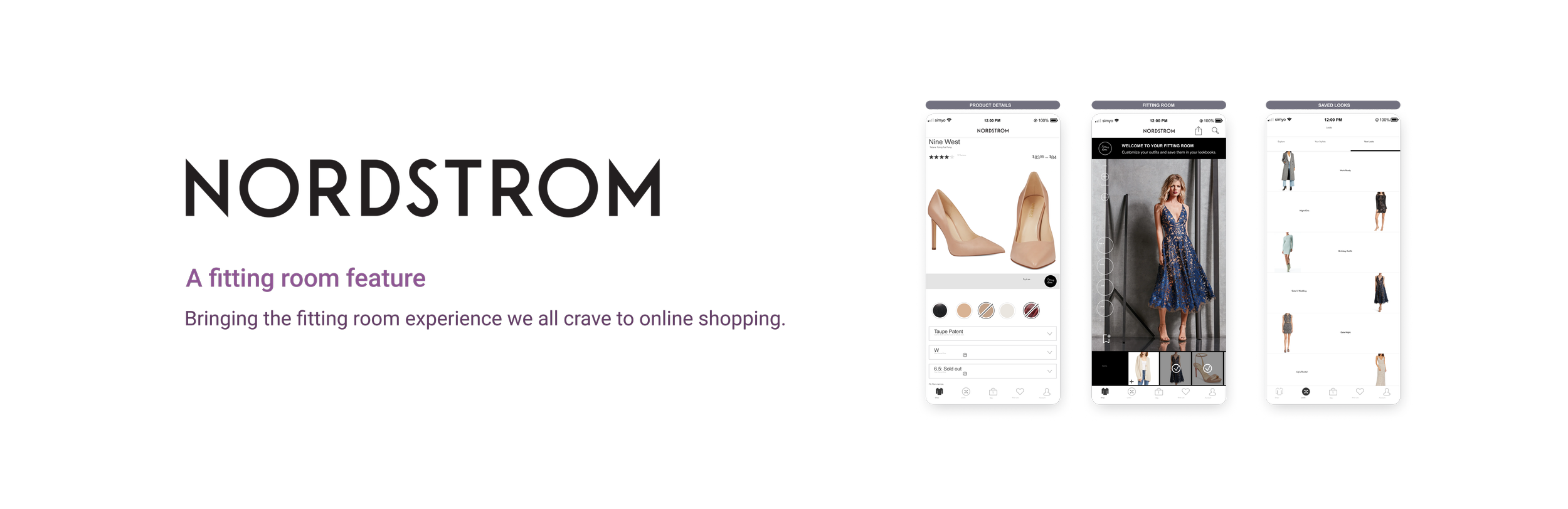
Nordstrom is a great and innovative shopping business that even allows for the matching of clothing items from other stores or images. Utilizing the camera, they provide purchaseable clothing items with the same look as the photo that the users take. Their vast selection of clothes each season is thrilling to try on in stores and their application is intuitive to use. With the fitting room feature, Nordstrom would provide the complete in person experience of shopping for a new wardrobe. For some, it can be a way to avoid the chore of having to go shopping in stores. For others, it can be an effective way to put looks together, and for businesses, it can be a way to minimize returns.

Research Goal
Understand what makes for the optimal shopping experience for shoppers. What they are missing in their shopping experience and if the fitting room feature solves that problem for them.
Research Objectives
Find out how users approach online shopping.
Understand users needs from their favorite shopping apps.
Address possible concerns users have when shopping online.
Look into the business competitors in the industry and find weak points.
Investigate whether there is a market for this feature.
Find out to what extent people are open to using their mobile cameras to submit photos of themselves to their shopping.
Assumptions
People want to try clothes on before they buy them.
People understand how to take photos of themselves and upload it to the app.
The fitting room feature will increase sales with the ability to see what items look like in combination.
People will be less hesitant to buy clothing when they see an item on their own bodies.
Methodologies
Competitor analysis - helps get a sense of what works currently in the market and what doesn’t.
User interviews - get a better understanding of the user through questions and conversation.
Co-Discovery - having the interview with a relative or friend makes for a relaxed and genuine discussion.
Usability testing - helps to see how clients navigate the website and make adjustments from there.

Market Research
I began my research with articles from fashion magazines, fashion blogs, tech blogs, anything that could give me a general idea of what people like about online retailers and what they are missing. I looked into what technology is utilized in the fashion industry thus far and what direction the fashion industry is going with tech. This secondary research provided me with sufficient data to reassure me that I can proceed with the feature.
Competitive Analysis
Overview
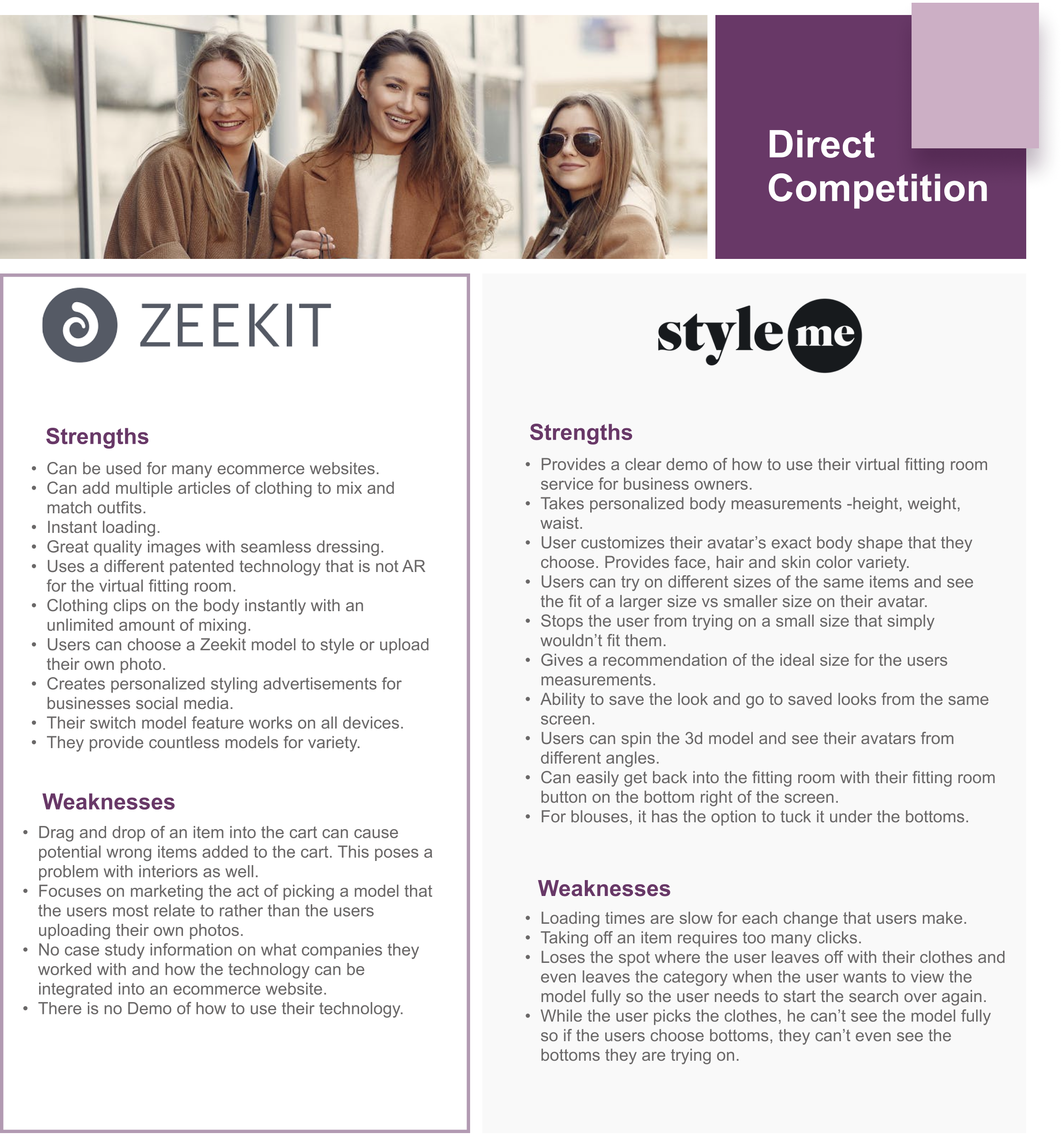
There is no mainstream e-commerce website that uses an elaborate visual fitting room as a part of their platform. The Direct Competitors are third party services that retailers could add to their website. ‘Style me’ and ‘Zeekit’ have the more advanced visual experience. With both, one can mix and match pieces to create outfits, the loading is faster than the competition, work on most devices, provide many models for variety. With ‘Zeekit’, users can choose a model to style or have their own photo uploaded while ‘Style me’ offers a 3d model that is customizable to an extent with the measurements applying the exact size of users to the model.
Both platforms are missing key features. ‘Zeekit’ does not have any explanation about how to use their software addition on an ecommerce website. It provides only one view of the model and that limits users on their ability to see the other angles of the outfit, deterring some of the users from making a sure purchase. ‘Style me’ on the other hand provides a view of all angles and full control over the movement, thus causing slower loading times. There are too many gestures to do in order to remove an article of clothing so it isn’t intuitive and stops the flow of getting virtually changed. Another flow stopper is when a user picks out bottoms, the user has to click out of the clothing menu to see the full sized model. Once the user sees the model and clicks back on the menu, his spot is lost and he has to start his search all over again.
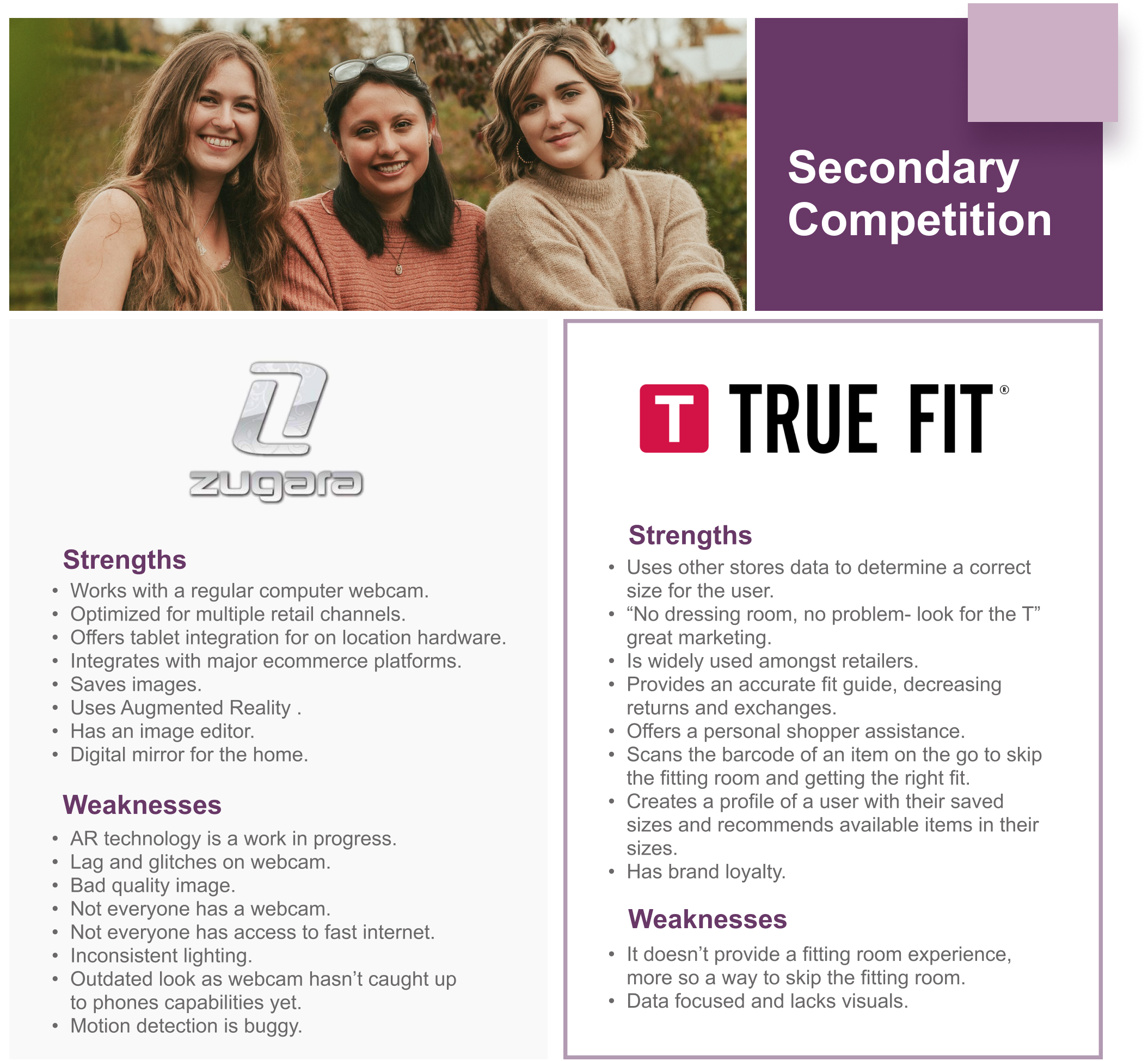
Out of the Secondary Competition, Zugara was popular amongst the designer brands. They provided kiosk experiences at events for people to try out their technology in stores. ‘True Fit’ is becoming the standard for retailers online to provide a good recommended accurate sizing experience. It is data focused yet does not provide any visuals.
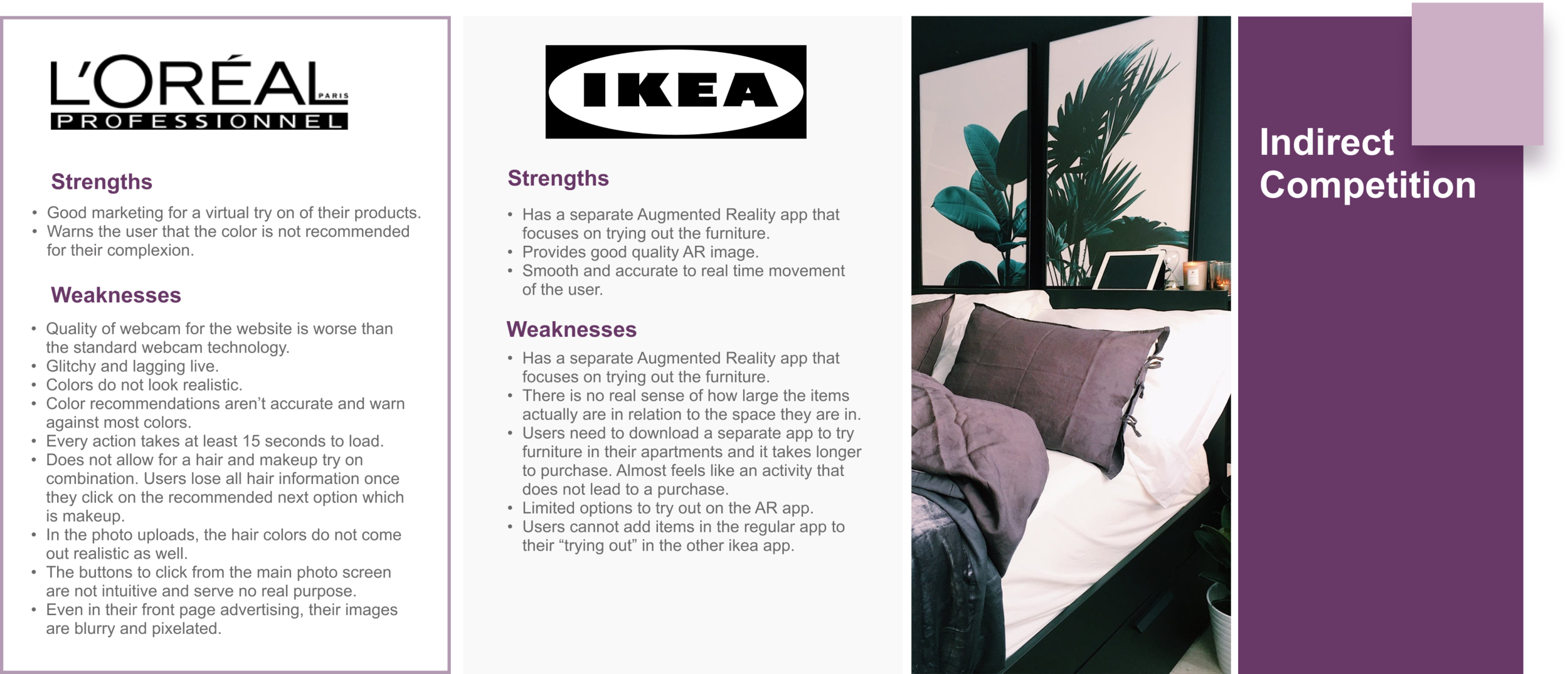
As for Indirect Competitors, both Ikea and Loreal provide a live visual experience of trying things out. Both have too many weak points that prevent them from being widely used. Overall, Loreal lacks too much in quality of images and webcam for users to have a smooth and pleasant user experience while Ikea suffers from the downsides of using current AR technology along with having yet another app to dowload for the users to have the sizing experience.
User Interviews
Having collected data on the market of existing businesses along with the purchasing trends and patterns, it was time to give the statistics some life. I prepared questions for 6 potential users to get a better understanding of their wants and needs from a clothing business. This helped me see how relevant the fitting room feature would be in the current fashion market. The interviews lasted for about 5-15 minutes each, and covered topics such as the use of personal photos on an e-commerce website, the benefits of customers seeing models their size wearing their searched items, and suggestions for businesses to make the online shopping experience more pleasant.
Participants
Interviews are of people who have done both online shopping and in-person shopping.
People will be of different age groups and different backgrounds.
Ages 16+

Chosen Retailers
Here you can view our users most used websites for online shopping.
I synthesized the data I collected so far to create two target users for Nordstrom to become the voice of the users interviewed.
These aren’t your typical target users. Both personas have their issues with shopping online and are proactive in providing their solutions to the problem at hand. Having a visual representation of the personas helps make the data gathered clear and user friendly. Here they are portrayed as they were during the interviews, innovative, edgy, efficient and successful individuals.
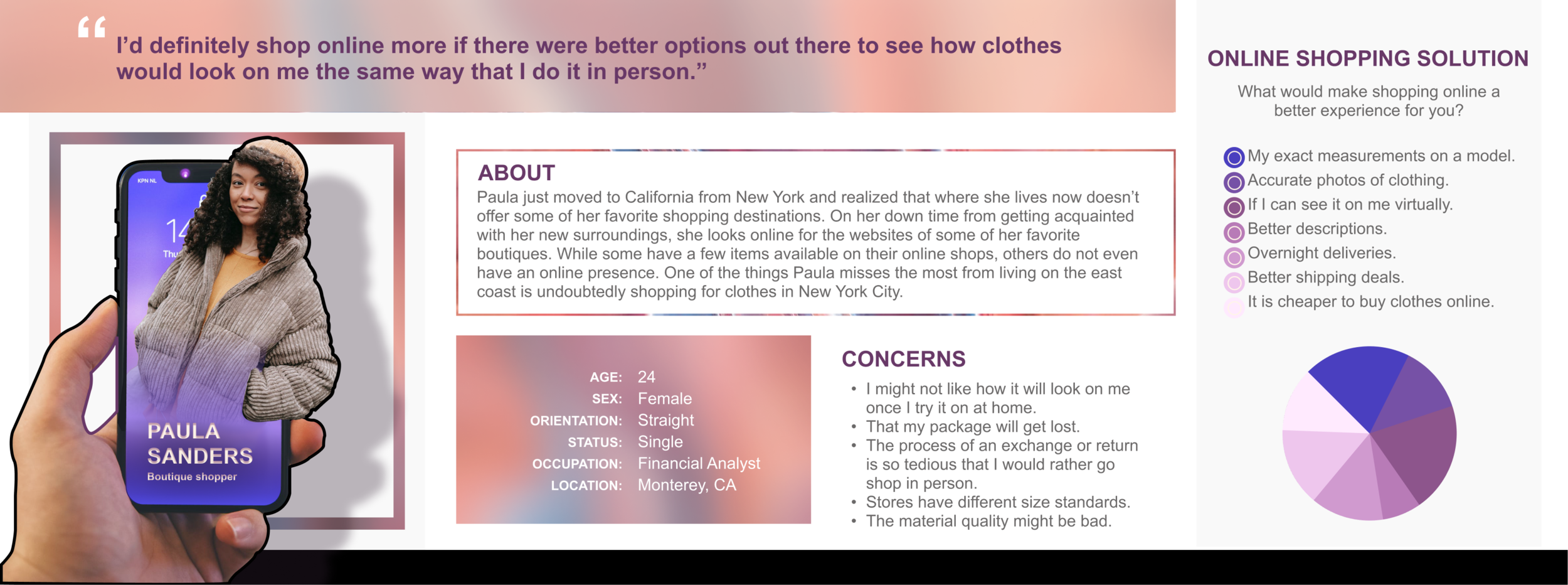
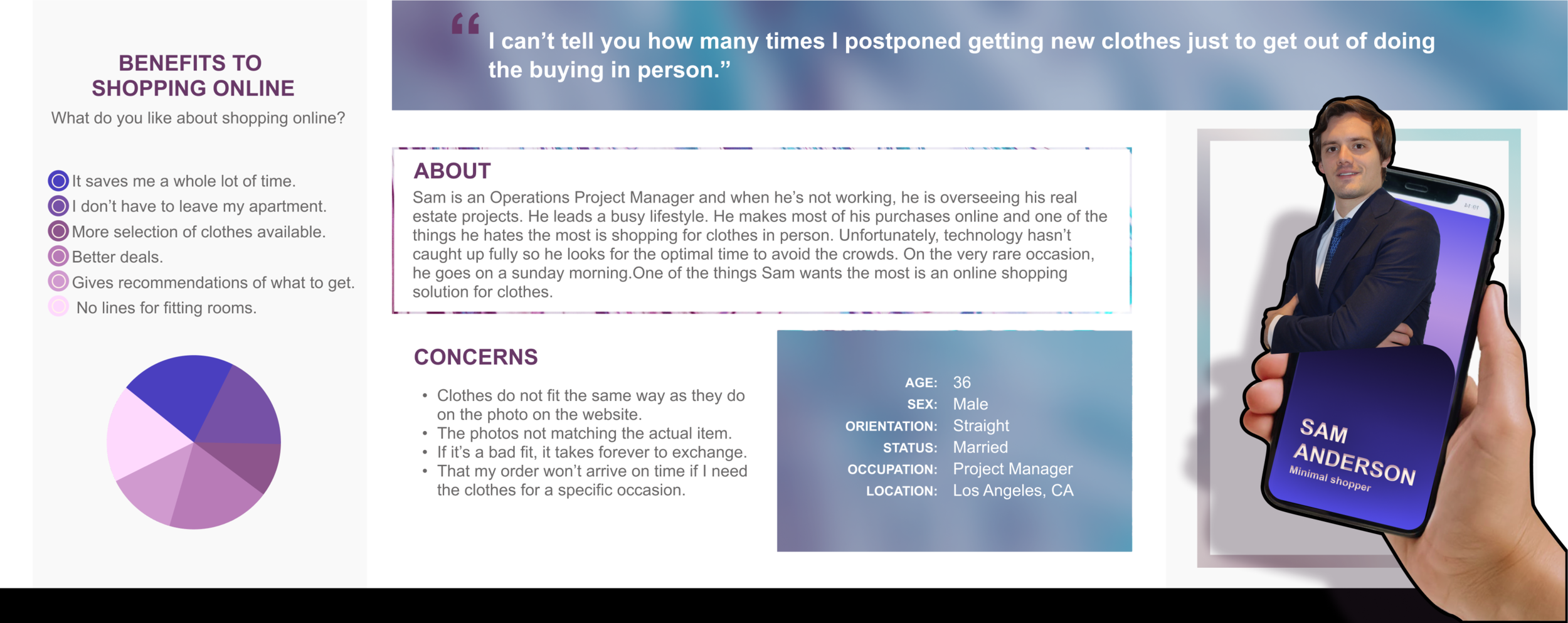
The fitting room would address the concerns we see from our user personas.
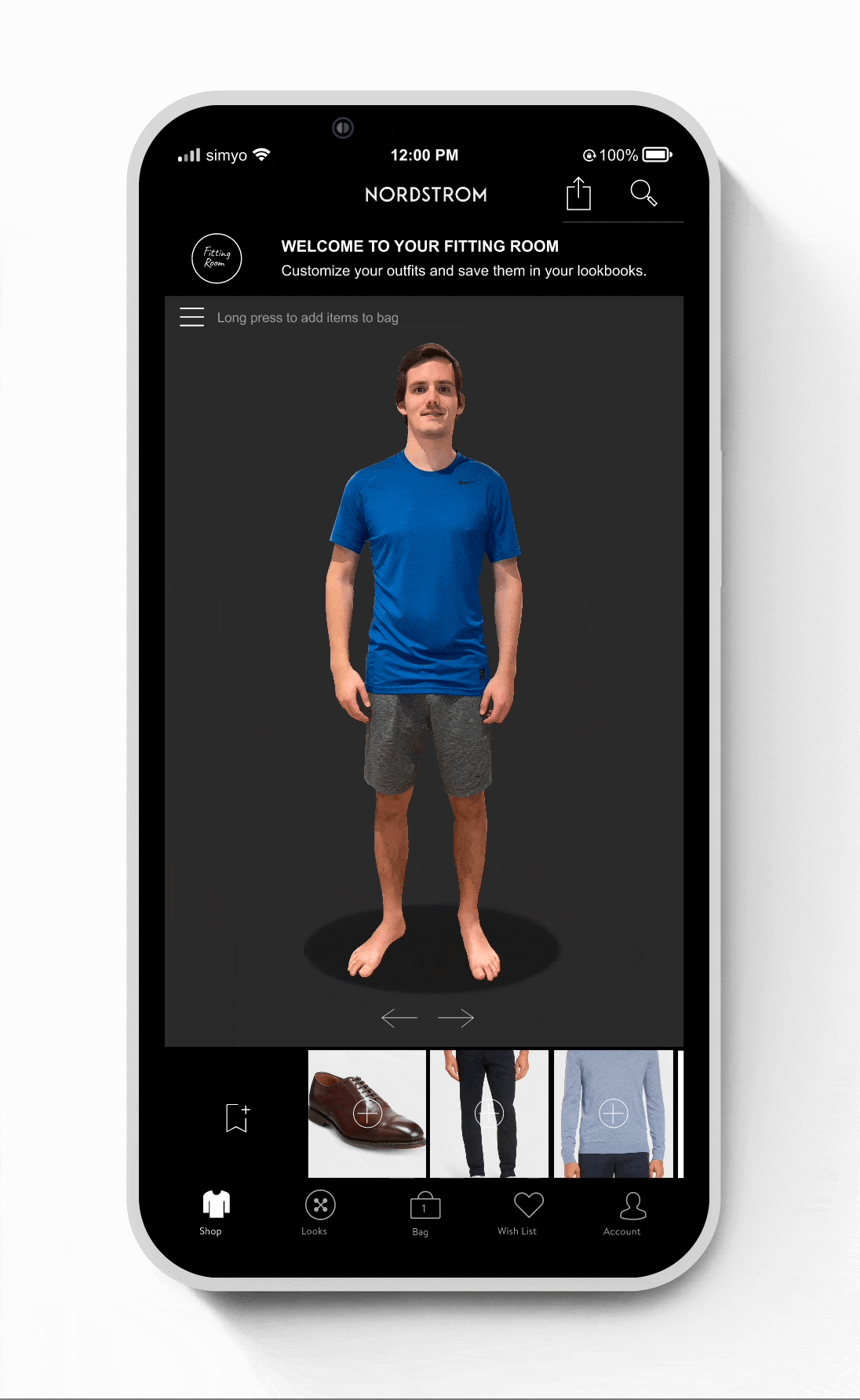
Nordstrom uses True Fit to take the measurements of their clients, but that does not provide for a visual experience of any kind. That is why the fitting room would be an intuitive solution. Here are the key features that the fitting room would provide:
When searching for clothing with a user’s true size set up, users would see models their exact size wearing their searched items.
The ability to add items to the fitting room to try in combination.
A fitting room shortcut to try on items as users search.
Users can upload their own front, side and back view full body photos.
When adding items to their photo, users can pick from lighting filters as well as different backdrops for different occasions.
Save looks in a user’s private look book.

Feature Roadmap
Here you can see the most important features to be added to the fitting room under ‘must haves’. It is also worthy to consider adding some of the ‘nice to have’ features because either way there are other applications that would allow clients to do such things as capturing a screenshot of an outfit. While size advice is not a mandatory addition, it can prevent many exchanges and returns, thus being a great option for the business. In terms of recommendations, we receive them in a less obvious way under or to the side of the item which we are viewing in many e-commerce clothing sites as well as Nordstrom itself so this would be simply speeding up the process of trying clothes on in the fitting room. In the ‘delightful additions’ section I added all of the closet organization as well as the community aspect of the app and while it is an entirely different realm of things, it can be very useful for customers to keep interacting with the app past purchasing. In addition, it can be a great help for users to get their purchased items organized and make the most out of their closets.
Existing Sitemap
Just as a book has a table of contents, a website has a sitemap. It encapsulates everything that the website has to offer the user. You can take a look at Nordstrom’s complete sitemap down below.

Sitemap - the Fitting Room addition


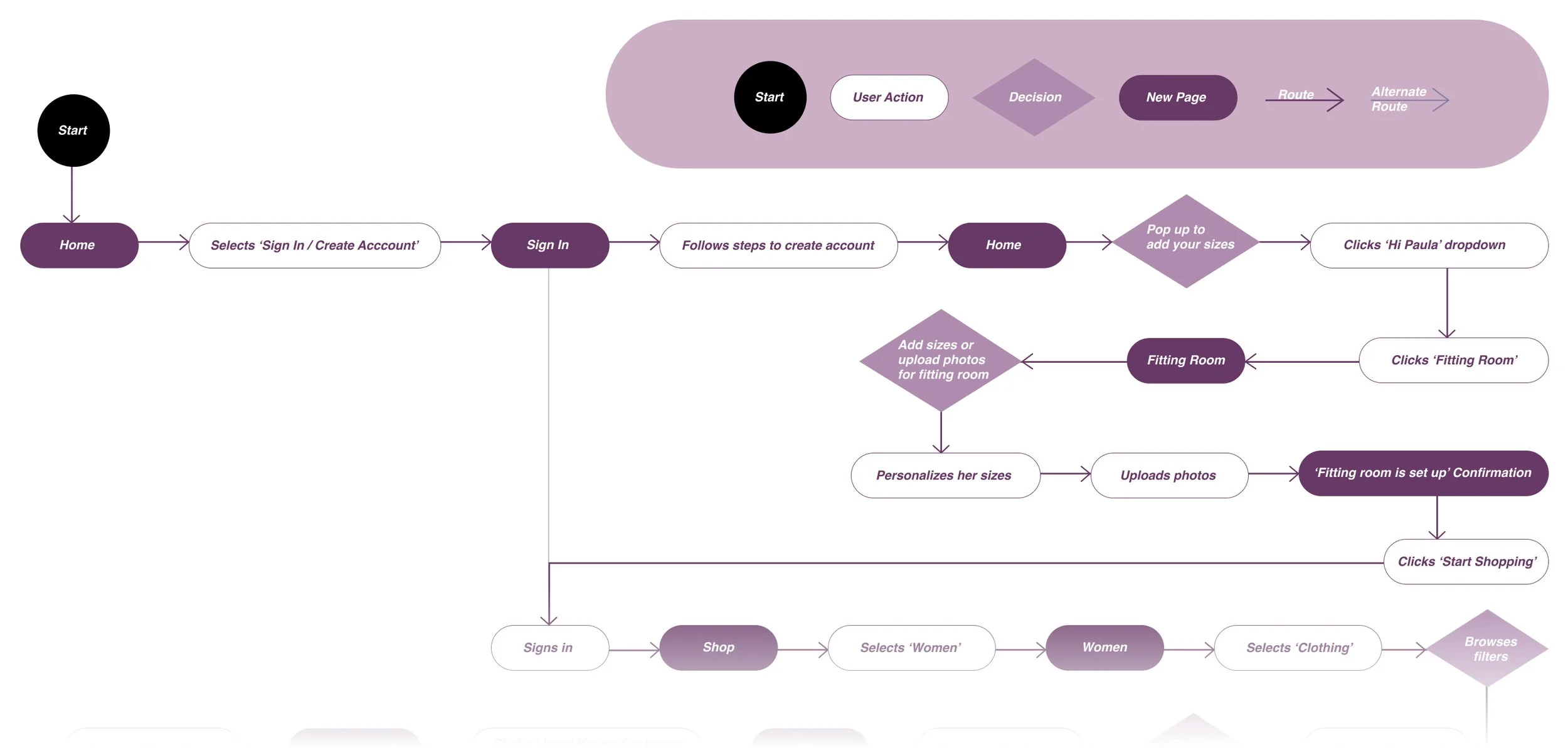
Task Flow
The task flow is a great way to visualize how users would interact with a site. You can find two categories. One is the user action and the other is the page that loads after the user takes the action. It could be to click, to select, to filter and to browse. In this task flow, I walk you through how a user filters for their size, picks out a dress, a cardigan and a pair of heels to add it to the fitting room to then purchase it.

User Flow

Paula Sanders, our target user, has become aware of our fitting room feature and wants to try it out. In this User Flow you can see her decision making process to get to the fitting room and try on some clothes before making the purchase. Unlike the Task Flow, which shows the main route a user takes to complete the task, a User Flow explores an alternate route as well to give our target user room for decision making.
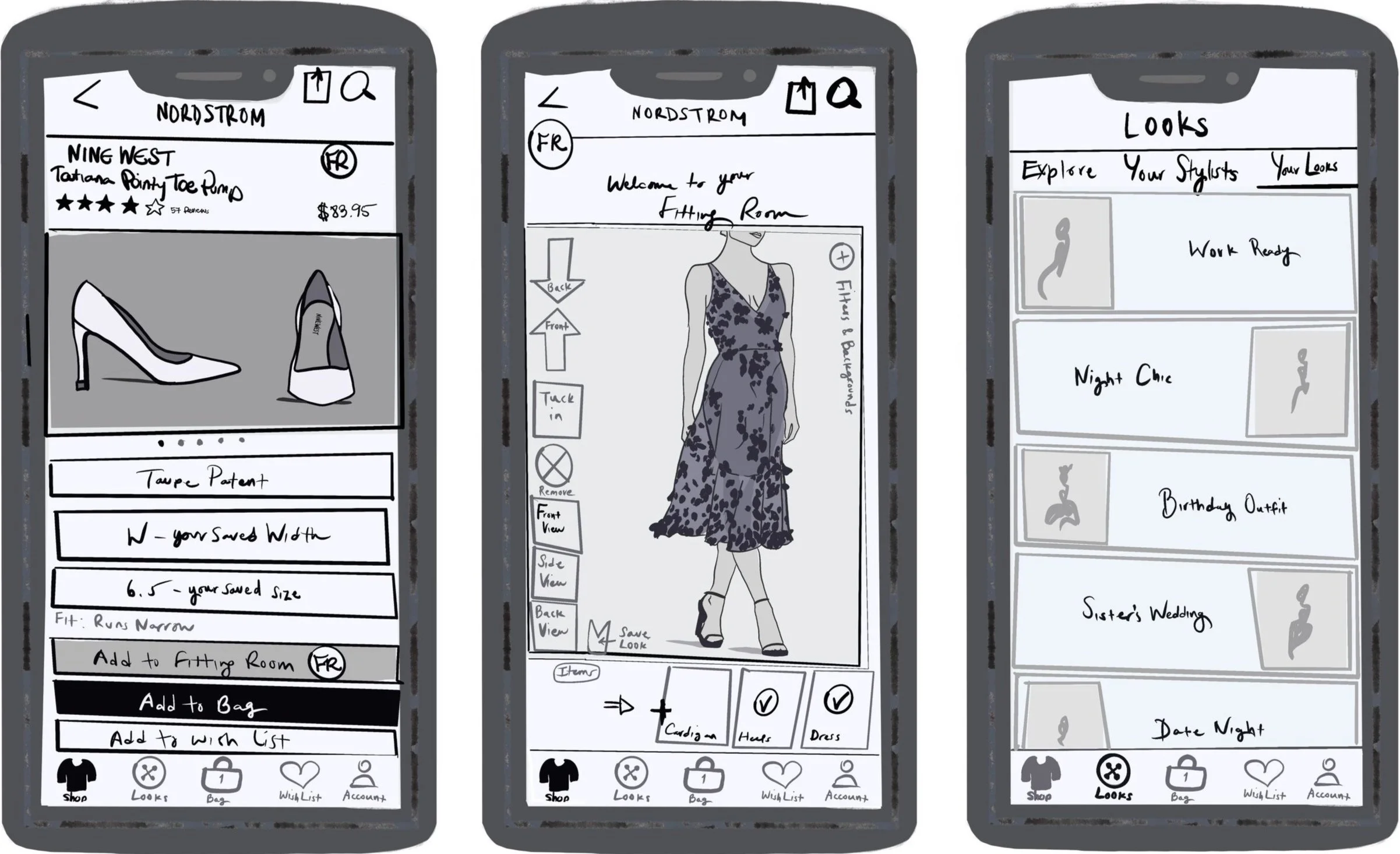
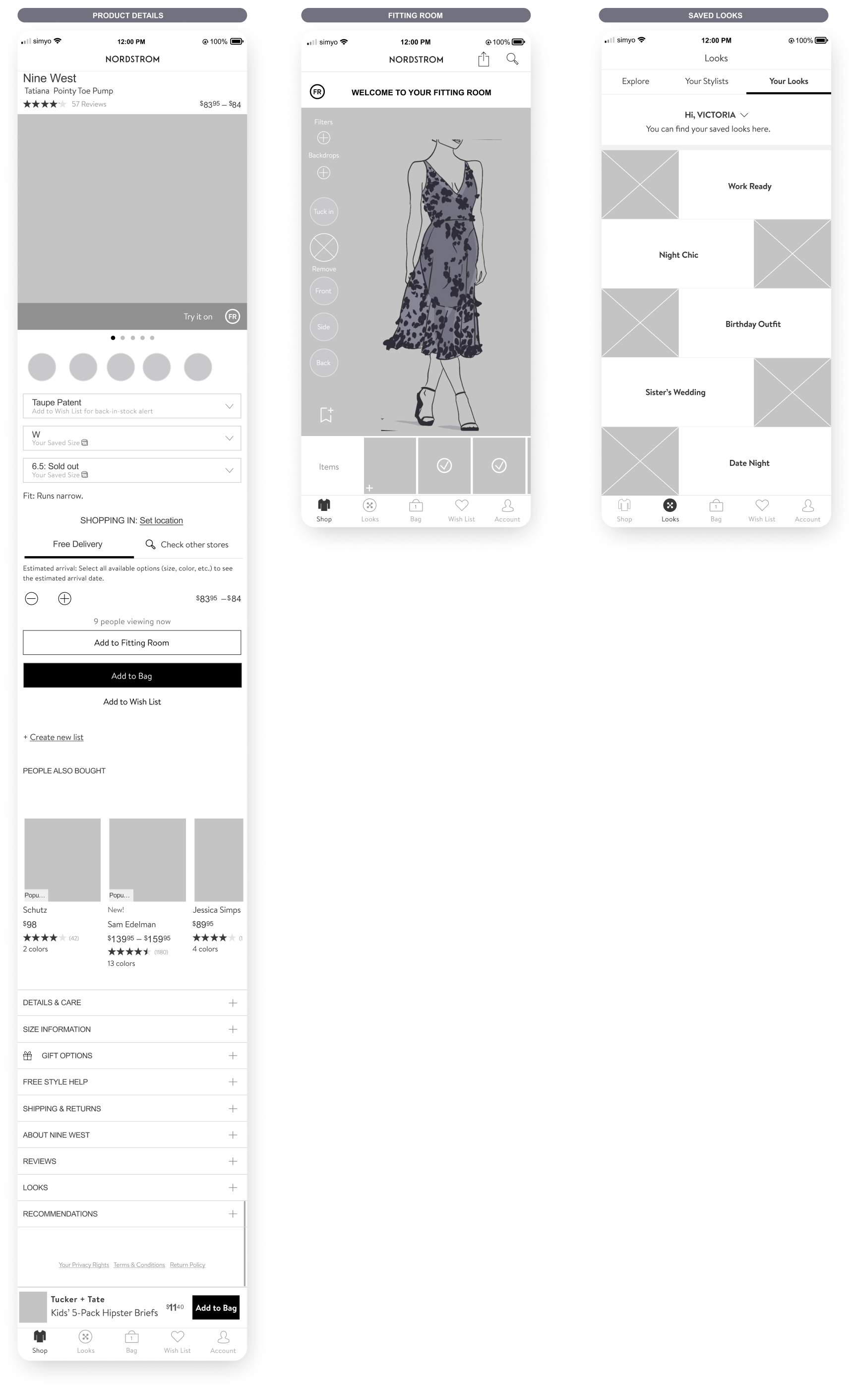
Low Fidelity Sketches
I wanted to visualise the 3 main screens that would give users access to the fitting room feature. In the first image, you can see a product screen with a small ‘FR’, the place holder for the fitting room icon. Just how users can add the Nine West heels to their bag, they can add the heels to their fitting room. When you click the ‘FR’ icon on the top right, you can quick view your fitting room with your previously uploaded image wearing the heels. Clicking ‘add to fitting room’ adds the item while the user continues shopping. The second screen is the main fitting room area and the third screen is how users can access their saved looks.
Mid-Fidelity Wireframes
High Fidelity Wireframes
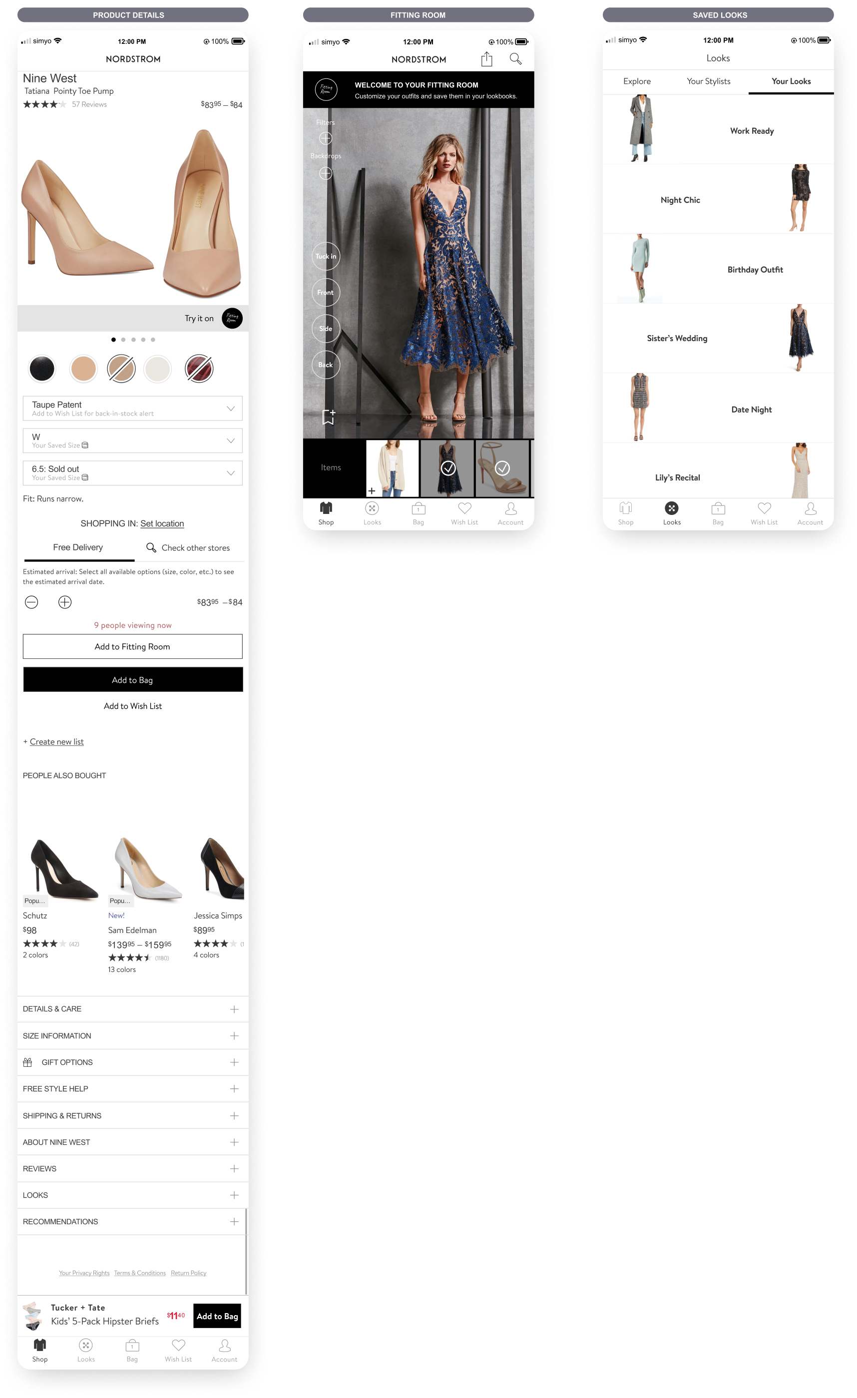
Inside the Fitting Room:
High Fidelity Wireframes
Fitting Room Feature: Brand Identity
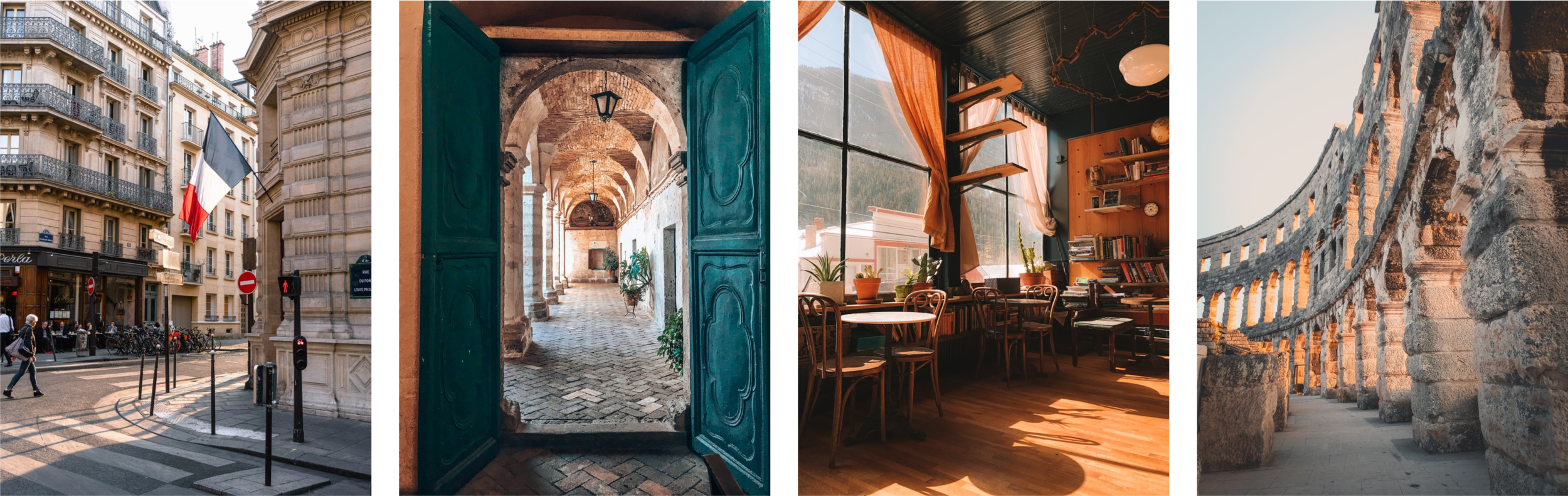
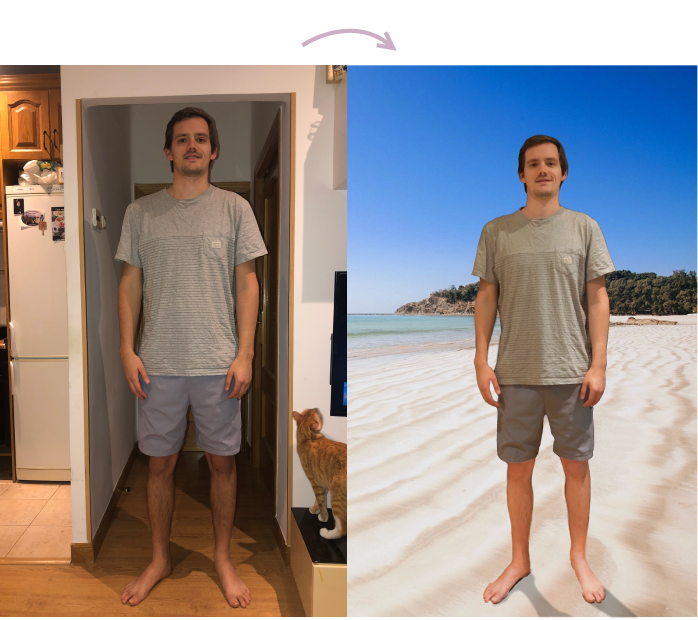
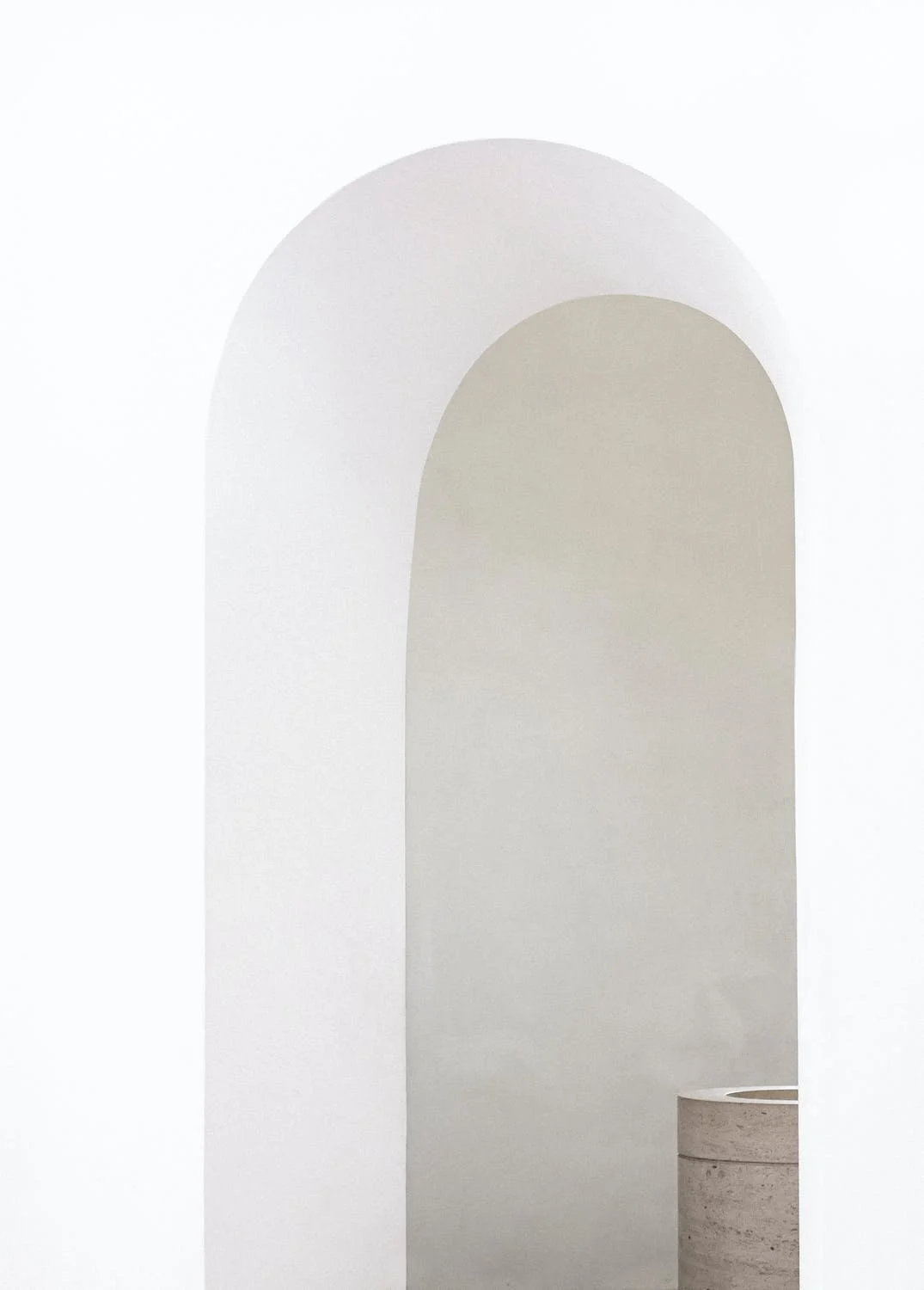
One of the great things about having a virtual fitting room is that users are not limited to a tiny space nor to a single location. Customers can visualise their looks in their desired destinations. Whether they are shopping for a beach vacation, their trip to Europe, a hike, a night outing or work attire, they can have the appropriate backdrop to complete their look.


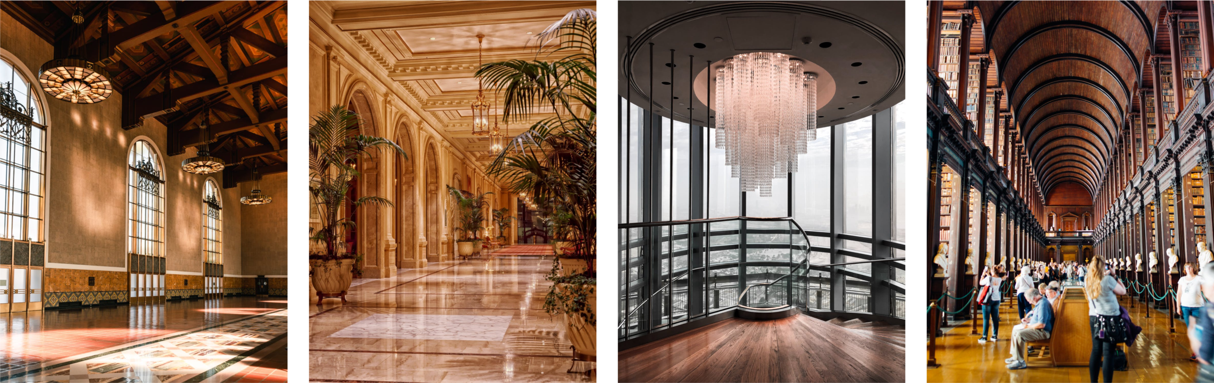
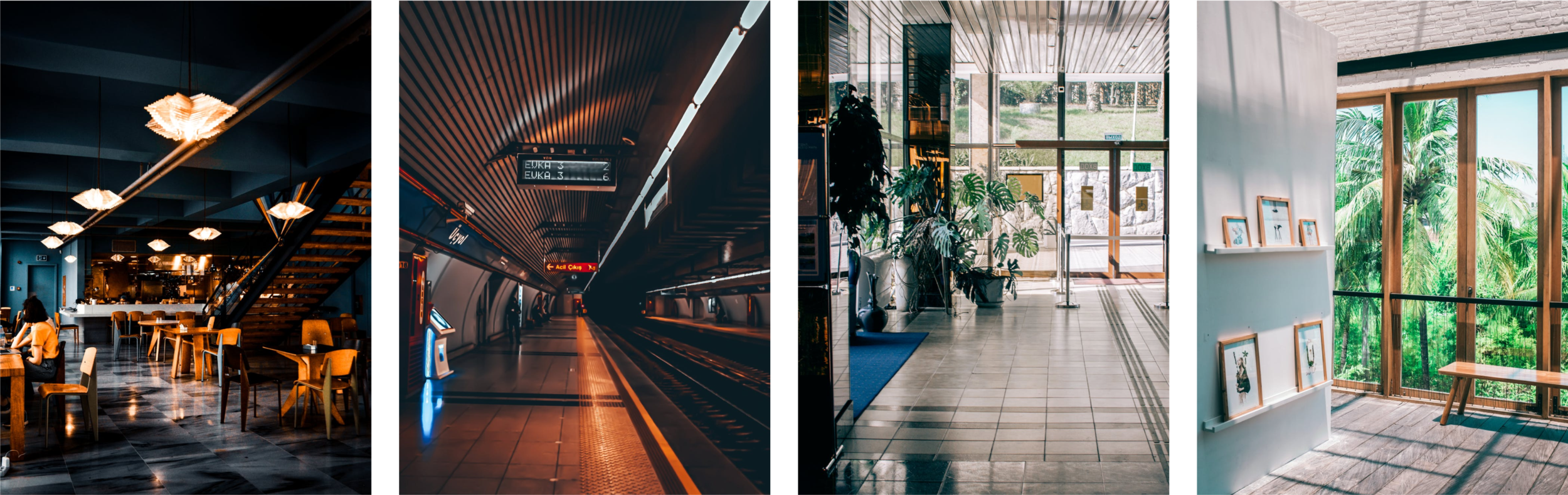
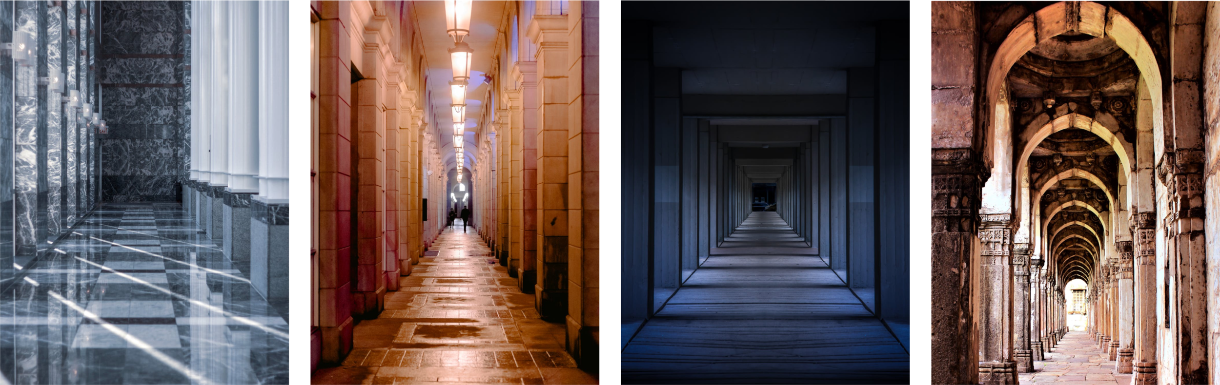
The lighting in their uploaded full body images will automatically integrate with the backdrop they choose.
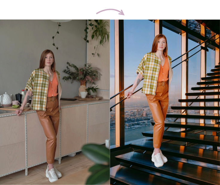
They will have the option to blur the background to their liking.
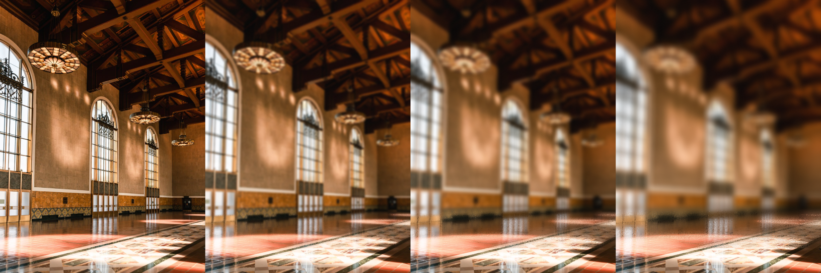
As well as the option of distraction-free backgrounds.


Prototypes
User Paula Sanders navigating to the fitting room
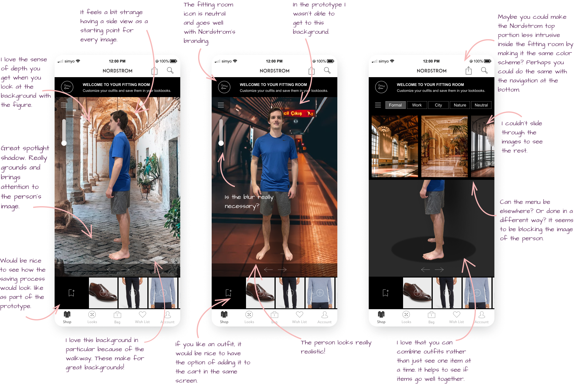
This first prototype is based on the user flow for Paula Sanders. Here you can see how a user representing Paula navigated through the prototype. Paula is looking to add a cardigan, a dress and a pair of heels to her fitting room. The purpose of this prototype is to show how the fitting room feature is integrated within existing Nordstrom pages. On each product details page we can see the fitting room shortcut button as well as the way to enter the fitting room after adding multiple items to it. We can also see how to access our saved looks.
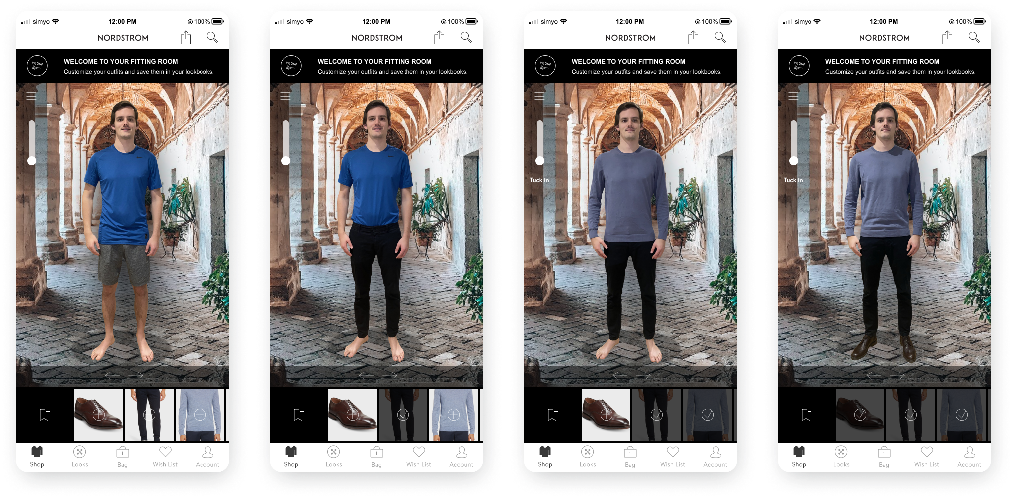
User Sam Anderson exploring the fitting room
This second prototype is to see how the fitting room feature looks while trying on the users selected items. Here we are observing another user representing Sam Anderson as he explores the ins and outs of his personal fitting room space. While he can technically try every item on in the main screen with the dark grey background, he has the option to match his desired look to a fitting backdrop. He starts with an uploaded photo of himself in interior clothes that he uploaded according to Nordstrom´s instructions. Then Sam views the different backgrounds, first choosing the nature background to see how it looks when his image is placed inside. He also makes sure to check out the blur effect. Afterward, Sam chooses an urban background, considering that he is shopping for formal attire. He tries on his sweater, dress pants and dress shoes, tucks the sweater in, untucks it and clicks on the arrows to view the outfit from all sides. He has the option to later save this look for later in his look book by clicking on the save icon on the bottom left by the shoes.
Testing
Usability Testing | Affinity Map
Usability Testing
Test objectives
-Understand the user’s thought process while using the fitting room.
-If users understand how to add items to the fitting room.
-If the interactions are intuitive.
-If there is anything that is missing for users.Test subject - High fidelity prototype - mobile.
Test methodology
Participants will follow instructions to navigate the prototypes for choosing their items and then trying those items on inside the fitting room.Participants
-Ages 20-67
-Regularly shop online & in person
-Have shopped at NordstromRecruitment plan
In person & video interviews.Script procedure
-Introducing the Fitting Room feature.
-The users need to test two separate prototypes. One leading up to the fitting room and another inside the fitting room.
-Ask users to voice their thoughts throughout the process.Test goals
-Users understand how to use the fitting room feature.
-Users utilize the different backdrops and blur effect.Test completion rate - 100%
Error-free rate - 100%

Affinity Map
Users found that it was intuitive to navigate the fitting room for the most part. Some remarks were made about the placement of features and even the necessity of certain aspects such as the option to blur. Some didn’t like the look of the white bezels inside the fitting room and others needed to see more functions covered in the prototype such as the process of saving an outfit and adding items or a complete outfit to a cart.
Likes:
Realistic user image figure
Backgrounds with sense of depth in relation to the user figure
Spotlight shadow
Fitting room icon
The ability to combine items to create outfits
Passage and hallway backgrounds are great backdrops
Dislikes:
Blur
White bezels
Backdrop images menu placement
Side view starting point for the user image
Sliding backgrounds in the menu
Lack of the saving function explanation in the prototype
No add to cart option

Improvements
Users testing the updated prototype reported a smoother and a more seamless experience throughout the whole test. Delays were improved, visual distractions were removed, bezels were darkened to match the fitting room experience. The users have their uploaded image front facing as their starting point. The backdrop menu is less intrusive. All screens have the option to come back to previous screens. The option to blur was removed from every screen. Scrolling is more intuitive and the ability to save items has been explained more clearly. Additionally, with a long press, it is possible to add items to the shopping bag for checkout. To the right is a recording of how the prototype looks in Figma and down below is the option to view and click through the final prototype file.