

Problem
Upon moving to a new city and apartment hunting, clients are faced with some predicaments. Rent prices are getting higher every year. They want to get that great apartment but cannot afford it on their own. There is an agency fee, two months deposit and a first month’s rent. They don’t know anyone in the city and are aware of what a pain it is to look for a room to rent in an already occupied apartment.
Solution
Instead of starting their search for apartments, they start their search for their future roommates. They will be matched with like-minded people with similar living styles. Once they’re matched with their group, they can attend Joey’s organized community events and meet them in person. Once they have their apartment contract, Joey can also provide them with a loan for their initial move-in cost, which they pay monthly with their rent payments with affordable interest.

Research objectives
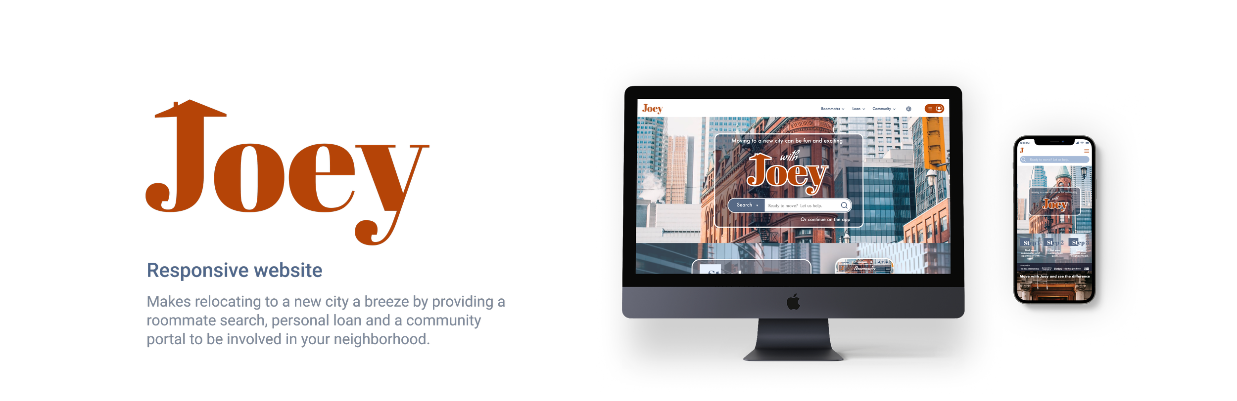
Joey is looking to design a responsive website for clients to make moving to a new city affordable, intuitive and exciting. The goal is to understand the needs of people looking to relocate, the obstacles they face and find a way to make them familiar with and thrive in their new community.
Find out how different users in various situations in life approach relocation.
Understand users needs from their residential communities.
Address users safety concerns regarding their search for roommates and apartments.
Look into the business competitors in the industry and find weak points.
Investigate personal loan and banks credibility and proper yet affordable interest rates.
A business model that would encourage widespread use.
Methods
Competitor analysis User interviews Co-Discovery Usability testing
Assumptions & Risks
People need resources and assistance to relocate.
At one point or another, people need personal loans and understand the concept of making payments with interest.
There is no single functional solution to help with finding roommates to rent an apartment with, take out an initial rent loan and get to know their residential community and connect.
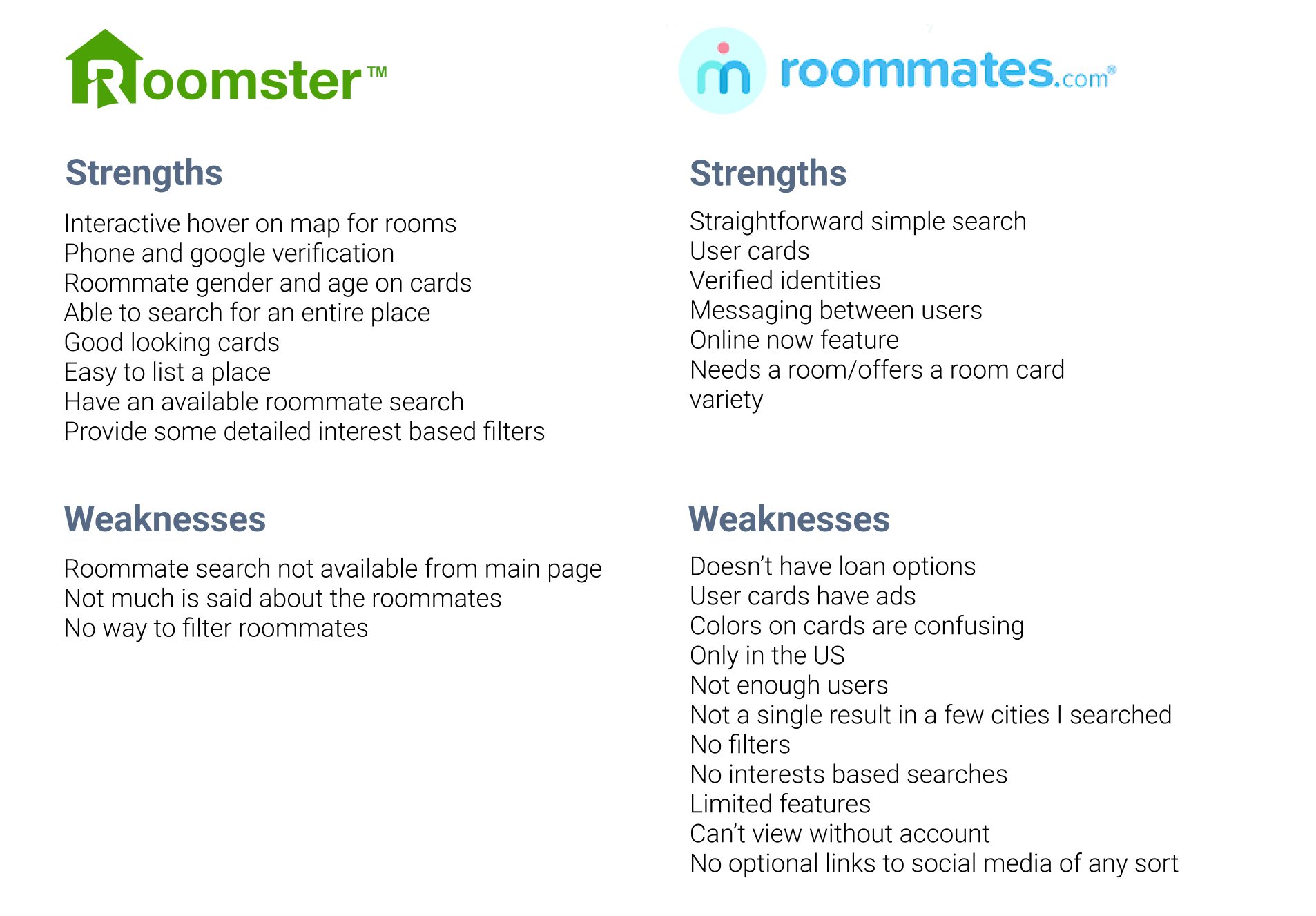
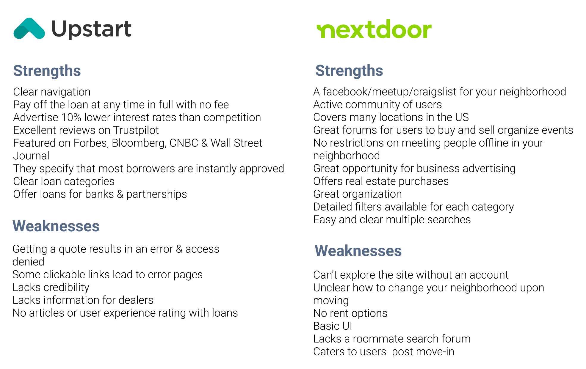
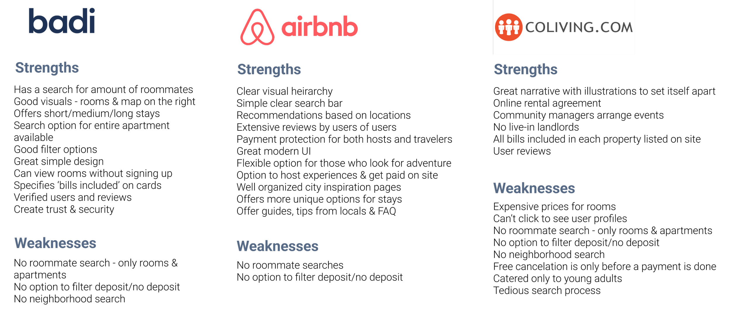
Competitive Analysis
A business that provides the initial move-in loans with monthly payments, a functional search for potential roommates, online apartment contracts between users, community managers to arrange events as well as regular users organize events does not exist. The Direct Competition does not have enough information about its users to filter and properly match, nor does it have enough users to be a competitive business on the market.
All competition to Joey has had success with some user flows that will be combined to create a helpful solution to the problems we face when we move to a new location.
The Indirect Competitors are a loan lending company called Upstart with high interest rates and low website performance resulting in credibility issues and Nextdoor, a successful ‘get to know your neighborhood’ website that does not actually offer a rent section or a roommate search sections. They do provide public forums on many topics including neighborhood news, selling and buying, local finds, deals, assistance, etc. Nextdoor makes it possible for neighbors to host events and offer services to each other for free or for a cost.
Out of the Secondary Competition, airbnb and badi have the most user momentum. Coliving is more for a specific audience so there is less traction and very little options. Both badi and airbnb provide for a basic apartment or room search rather than an option to search for roommates to sign a lease with.
The user interviews were of people who have needed to relocate in the past. People of different age groups and backgrounds, ages 20 and up.
What websites do users utilize for their roommate search?
Where do users search for advice on moving?
What are users worries when it comes to relocating?
What are some things users wish came easier in the search?
What are some things users do upon settling into a new place?
See the complete list of interviews here.

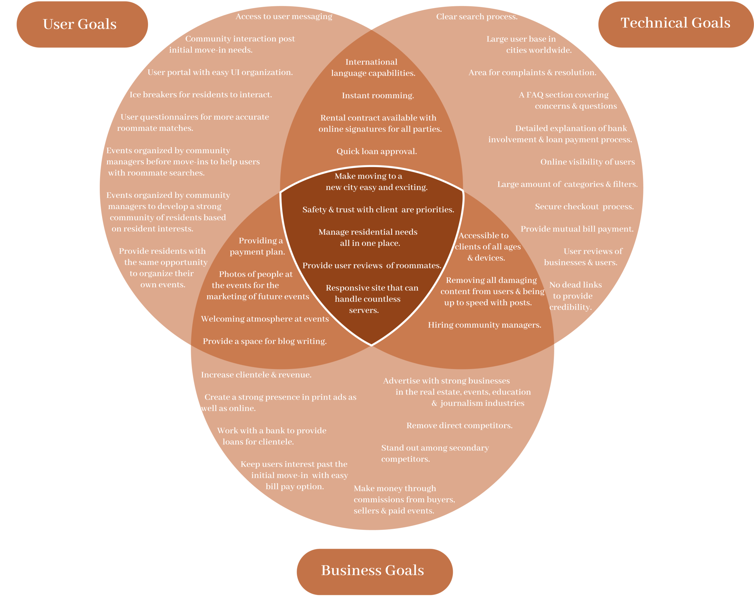
Project Goals
Upon having a clearer idea of the users’ needs, I was able to create a list of features that would accommodate my target audience while keeping business goals and technical features in high standards. Some key overlapping features are simplifying the process of moving for the user, safety being a priority, managing residential needs, user reviews for everyone using the platform, and a responsive website that can handle a substantial amount of servers.
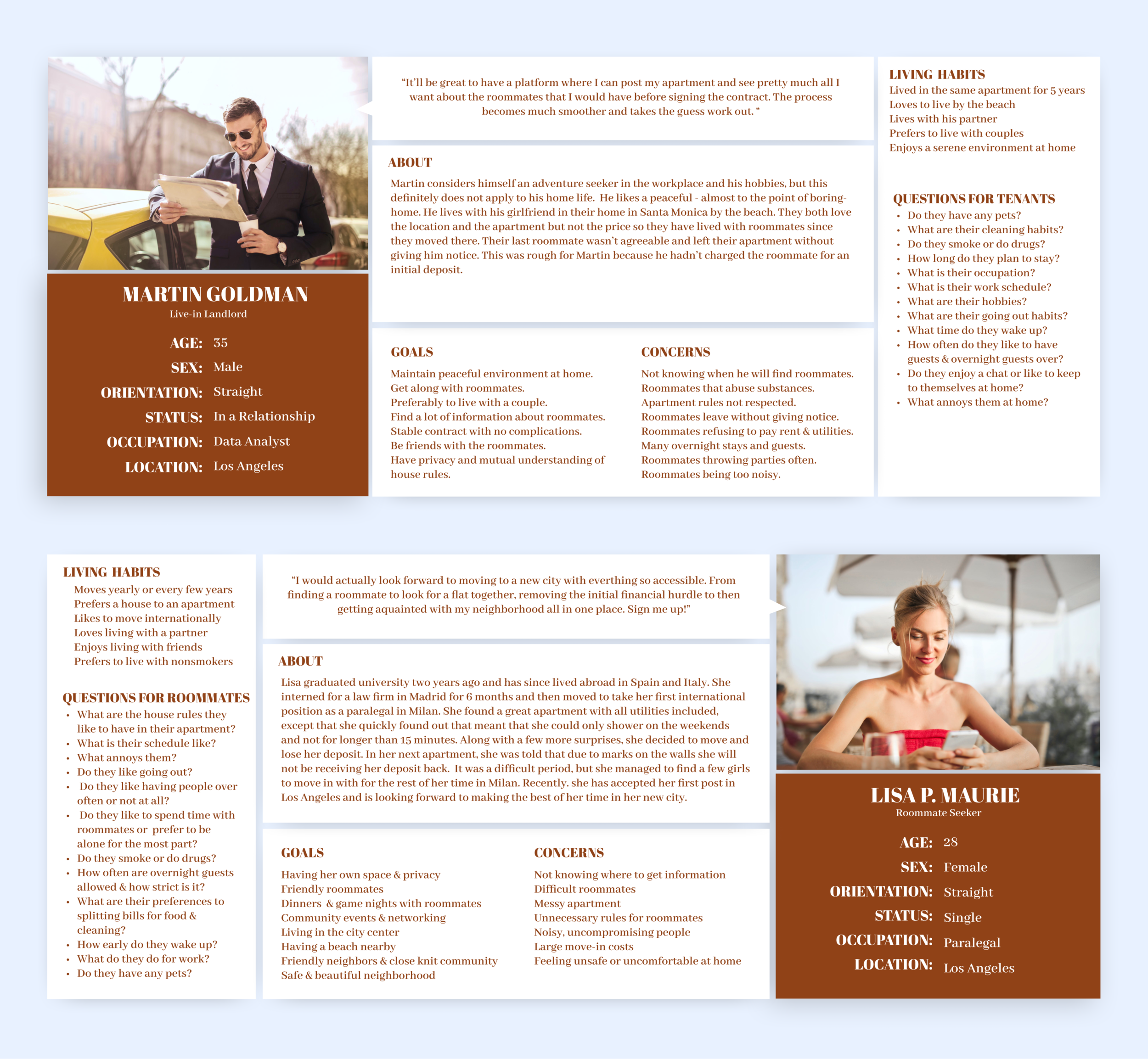
For my user personas, I needed a landlord that would post his apartment on the site and a roommate seeker that would post her ad to find a roommate with similar interests and living habits. Both ‘Lisa’ and ‘Martin’ represent a group of target users that would find Joey to be essential to their situation.
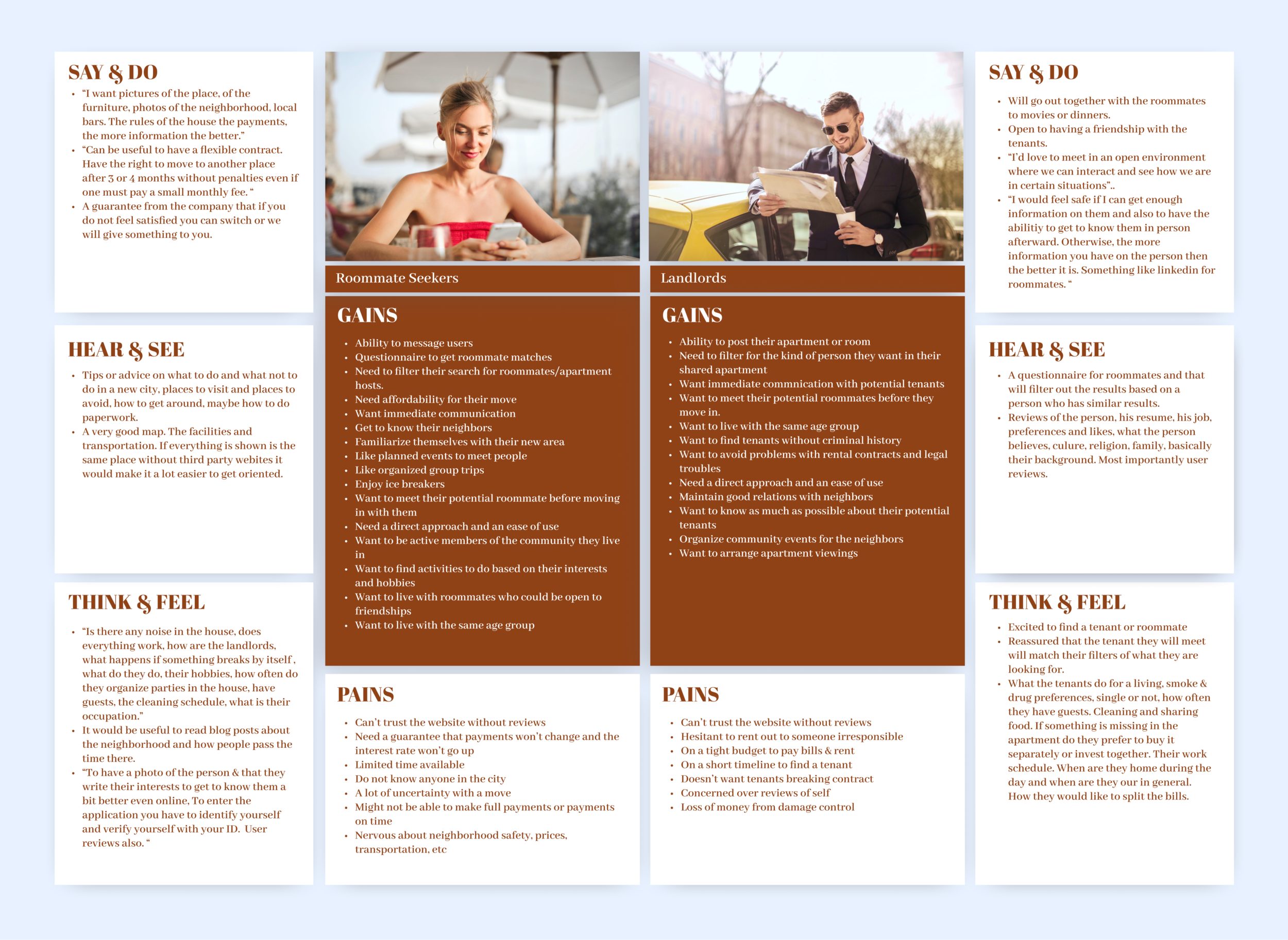
To dive deeper, here is an empathy map that analyzes the the target user with the collected information from the interviews. The user is facing a situation; he is then faced with a task and upon figuring out the task he needs to proceed to action in order to get his desired result. With ‘Joey’, once the user is faced with the situation, from the user’s initial desire to move, the rest is taken care of.
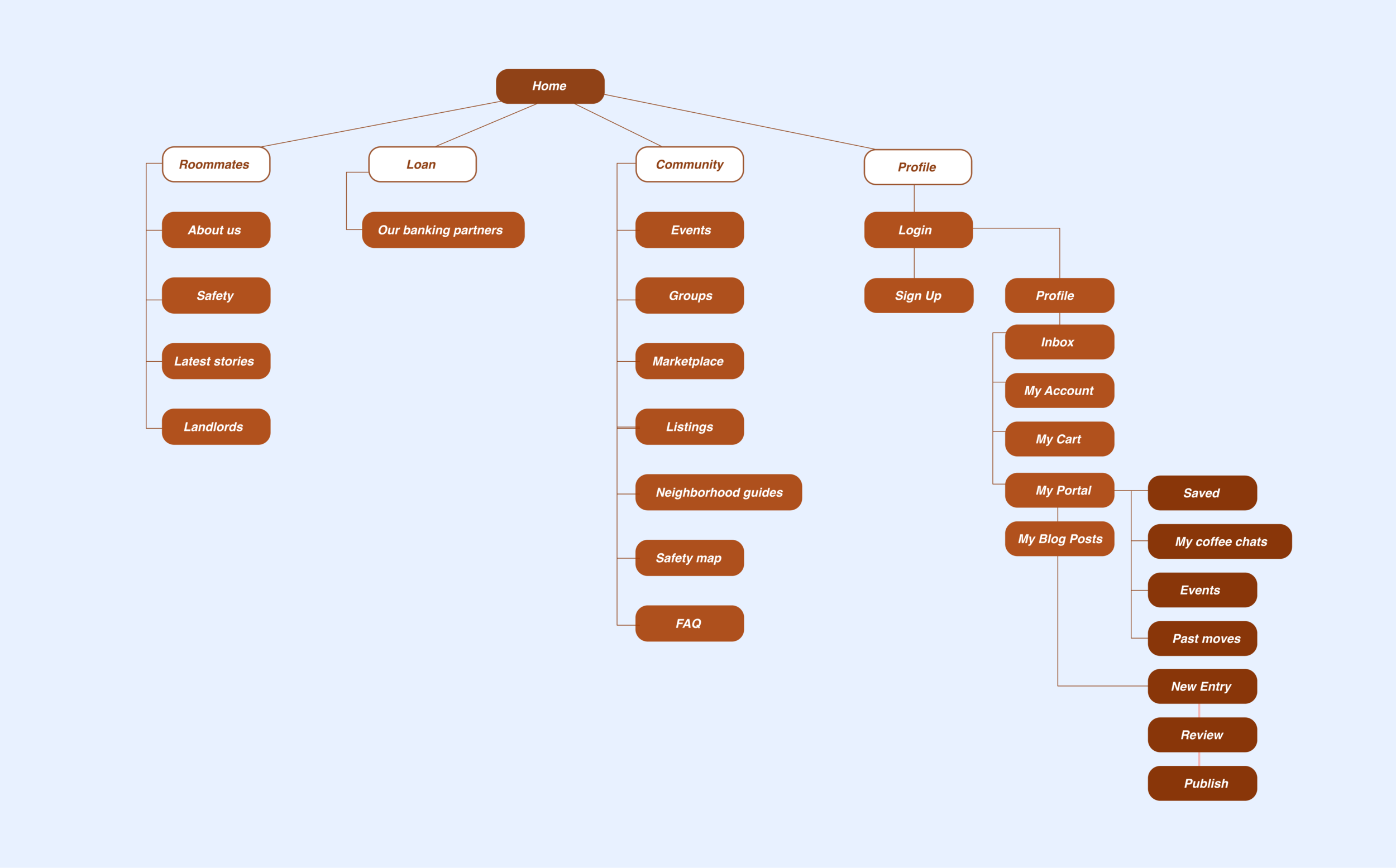
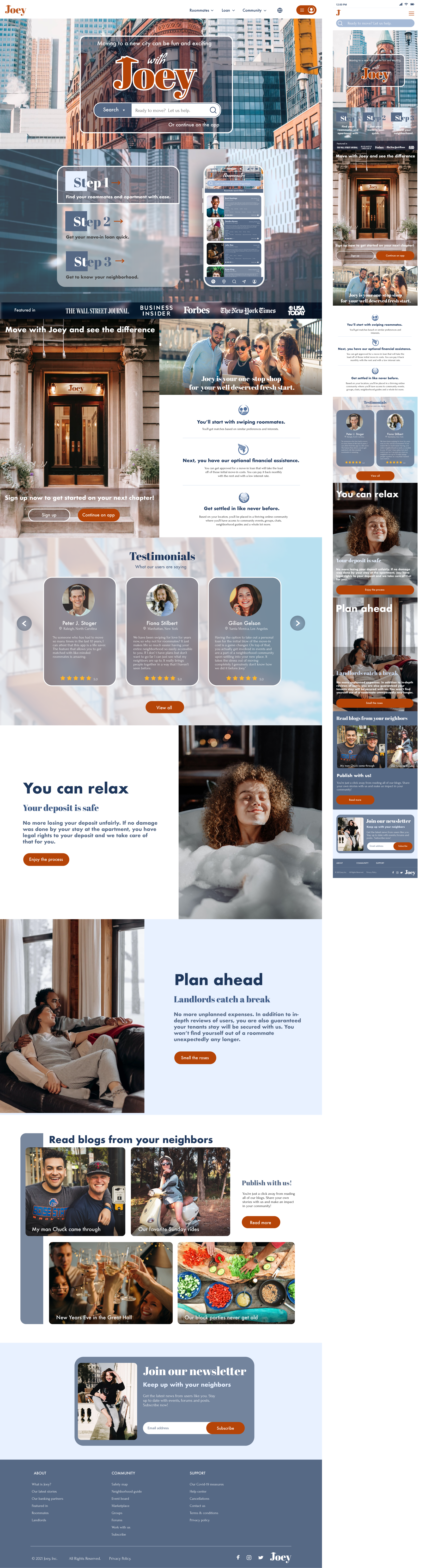
Just as a book has a table of contents, a website has a sitemap.
It encapsulates everything that the website has to offer the user. The main navigation focused on the 3 services offered, the living, the loan and the community. Inside the profile branch, users can navigate to their inbox, purchasing cart & history, blog posts and their client area in their portal. From there, they can view their scheduled events, upcoming coffee chats, history of moves, and they have the ability to publish articles based on their experiences with Joey and their neighborhoods.
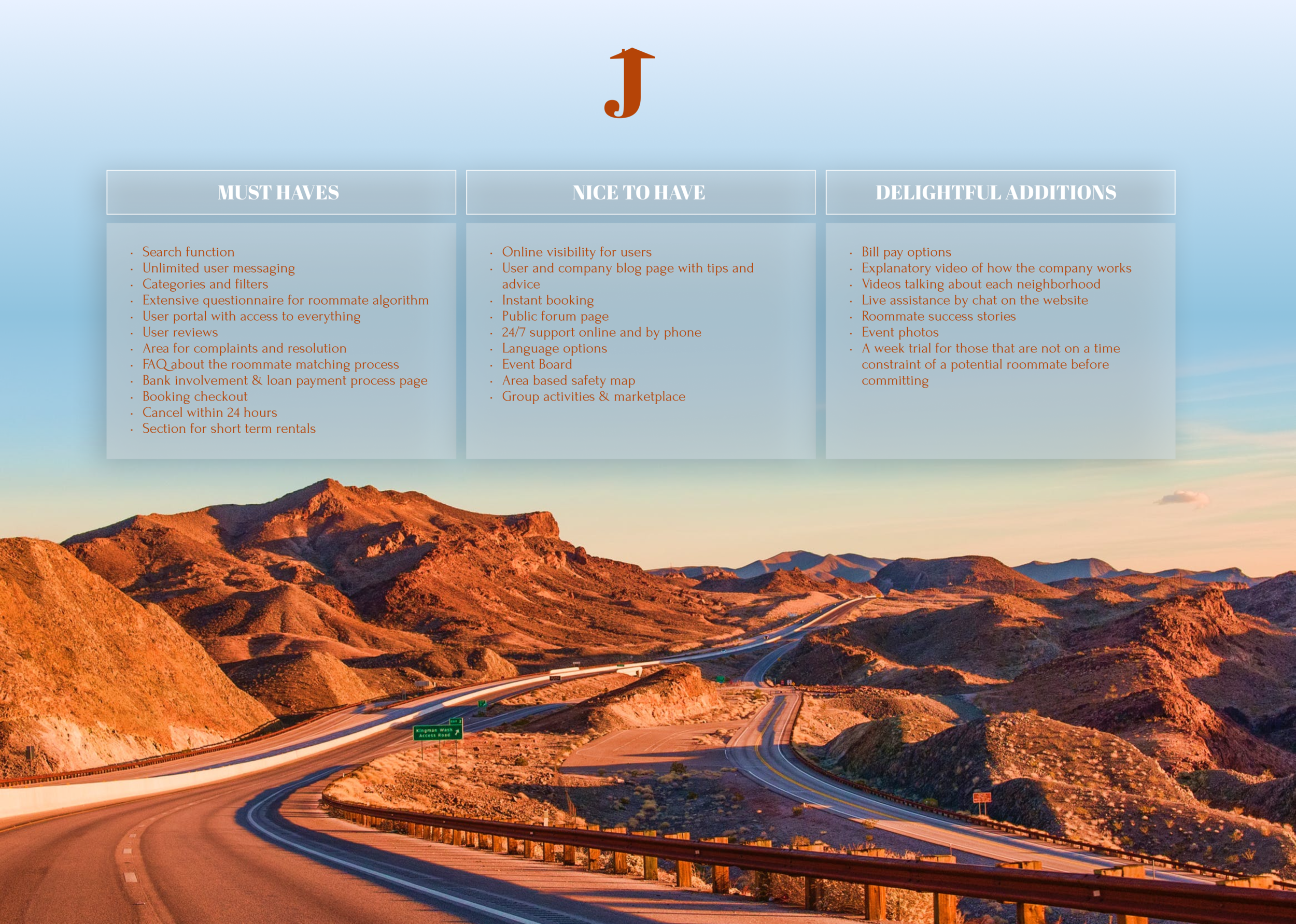
In the feature roadmap we can see the order of importance of the planned features.
Upon the initial startup, I’d focus on the must haves only to better focus the project and make the business have a solid, efficient mission. The second column is full of features that add cushion but are not needed for the fundamental creation. In the ‘Delightful Additions’ I put even more user friendly features that would add to a great user experience on both the website and application.
Joey would be marketed in local coffee shops, libraries, recreation centers, community centers, gyms, outdoor festivals and more.
The great thing about this business is that it is suited to be marketed everywhere. Co-living has been on the rise in the last 10 years and people are more open to it out of basic necessity due to the crash of the housing market and rise of rent, a desire for a different lifestyle or simply the instinctual need of a community. People want a solution to bring them together in a safe and pleasant way. The branding reflects that.

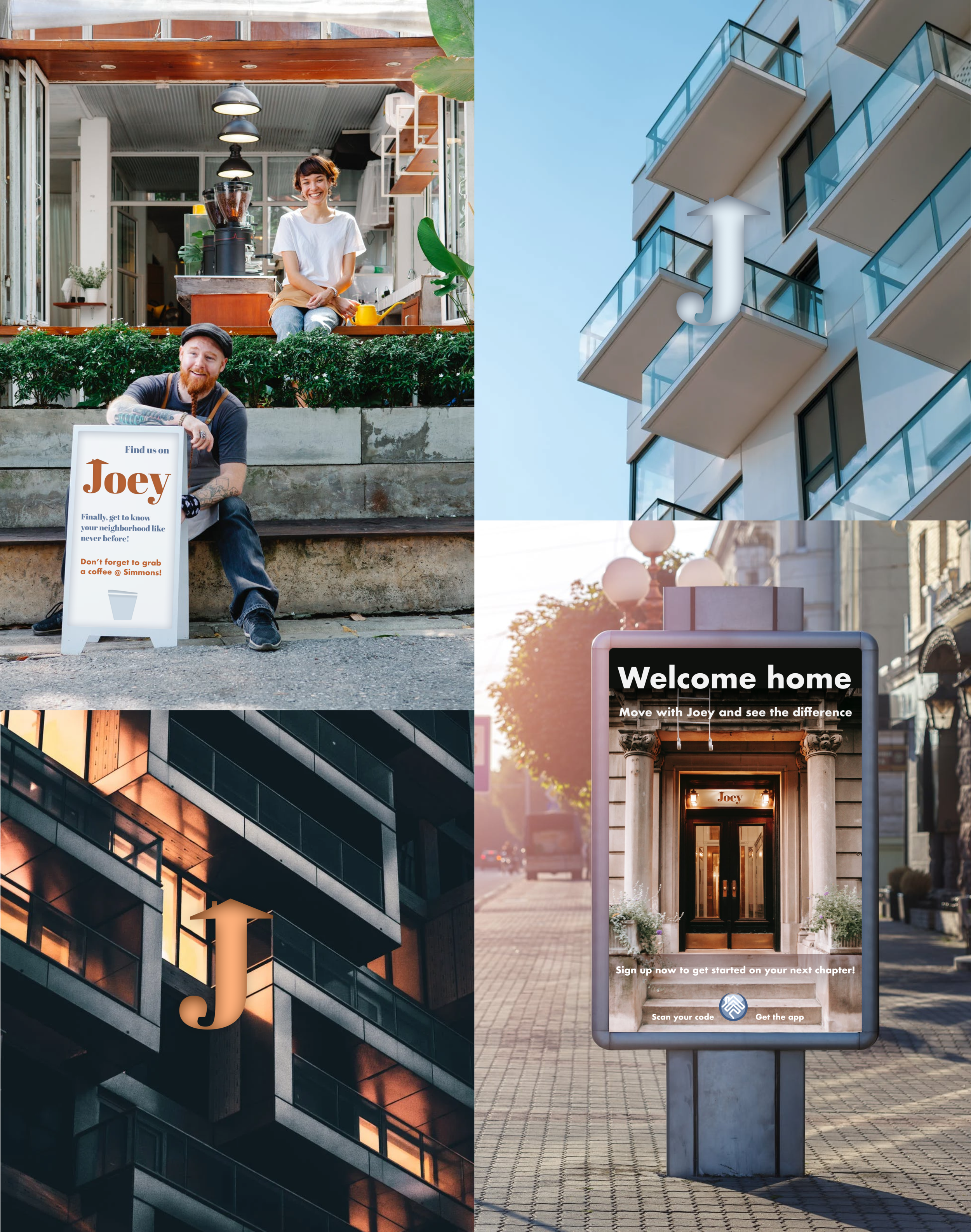
The mood board is one of the first things I do when brainstorming the visual experience of the business. It helps visualize the community that ‘Joey’ would cater to, what the neighborhoods would look like, the lifestyle inside shared apartments where roommates choose to live with each other and help each other, what activities they would be doing together. In the case of ‘Joey’, it is a photo empathy map.

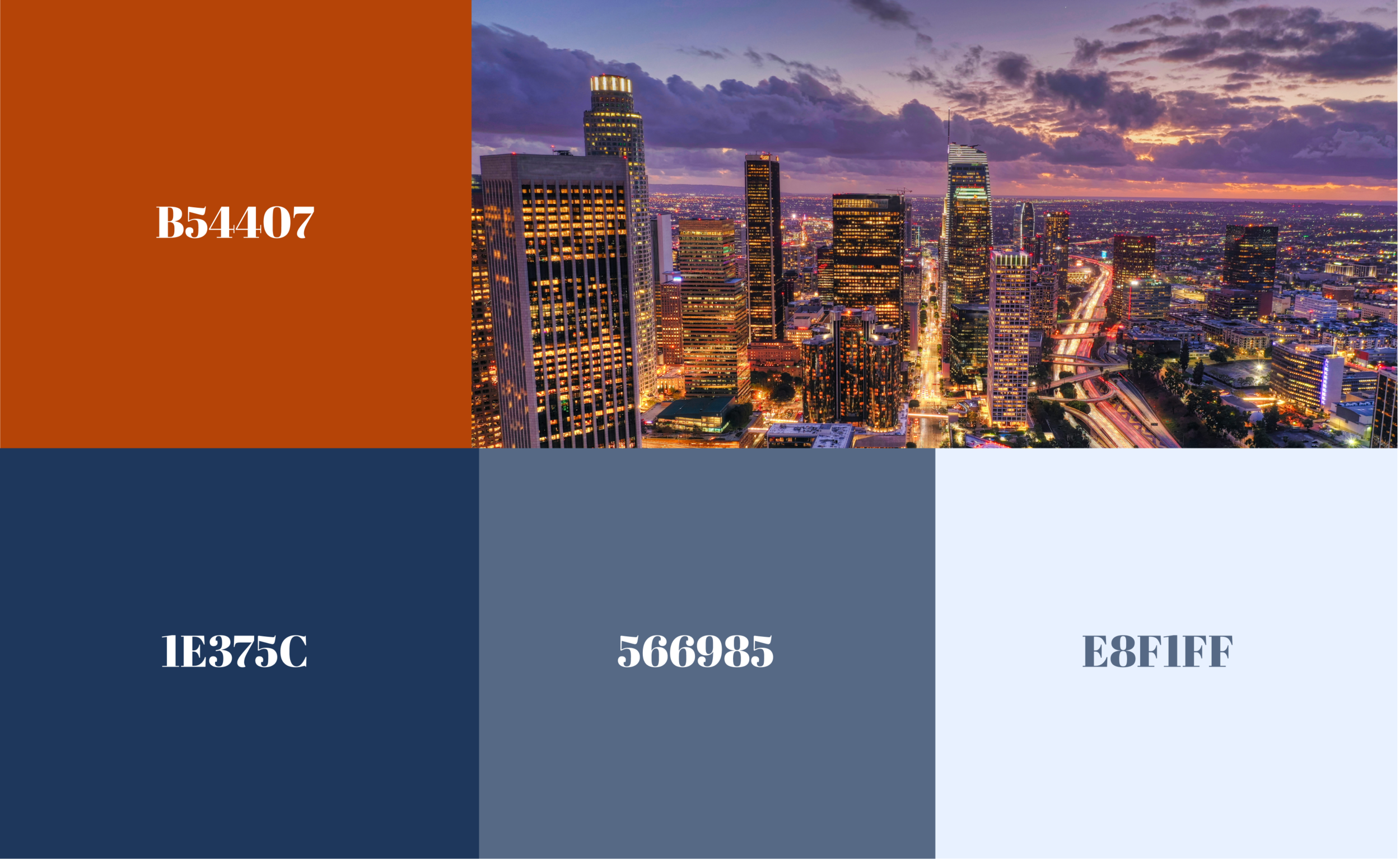
I wanted to transmit tranquility and a friendly, welcoming environment so I chose different shades of blue and orange to deliver those feelings. The typography is bold and modern, creating a sense of stability and forward thinking. The iconography is leaning more toward traditional to give a sense of the familiar, a family, a home, living habits and styles and a stable financial organization that would help users achieve those things.


With the style tile we can get a first look at all the elements in action together. The combination of blue and orange, the typography, images, sizing, navigation menu and the accent orange color on the button.
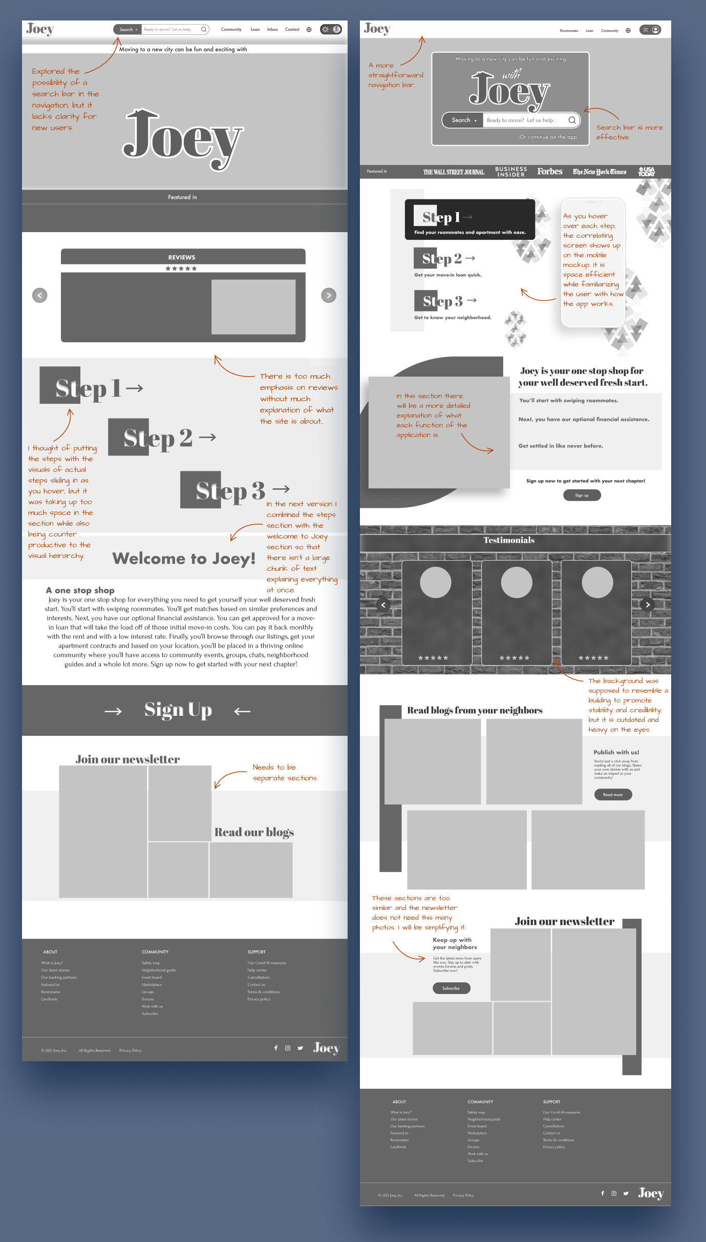
Low Fidelity Sketches
I wanted to create the 3 step scenario visually in a memorable way. Initially, I wanted to note it in prominent rectangles with arrows pointing to the steps for even more emphasis on order. In the next section, I wanted to explain each step further, acquainting users with the whole process of the application in the landing page.
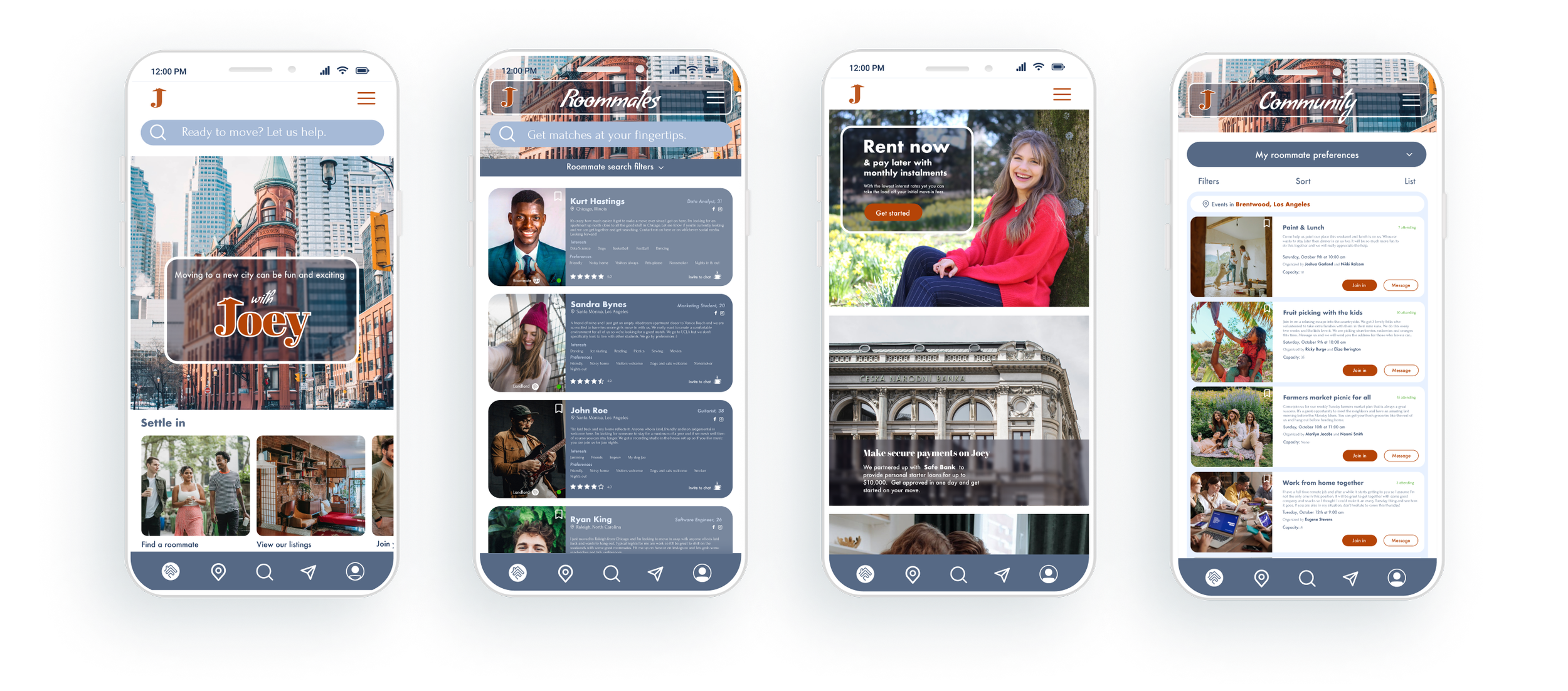
The search bar in the navigation would provide a quick way to get to every possible cause a user in on the site for.
The users looking to partner up with people to move in together could search for roommates only.
The room seekers can search for landlords.
The people interested in the application only for financial assistance could get to the loan page from the search directly as well.
For users looking to discover new places and plan their next move, there is an option of a search for cities to get directly to the city guides area.
Users deciding on which neighborhood in a city to move to can search through the neighborhood guides from the search bar.
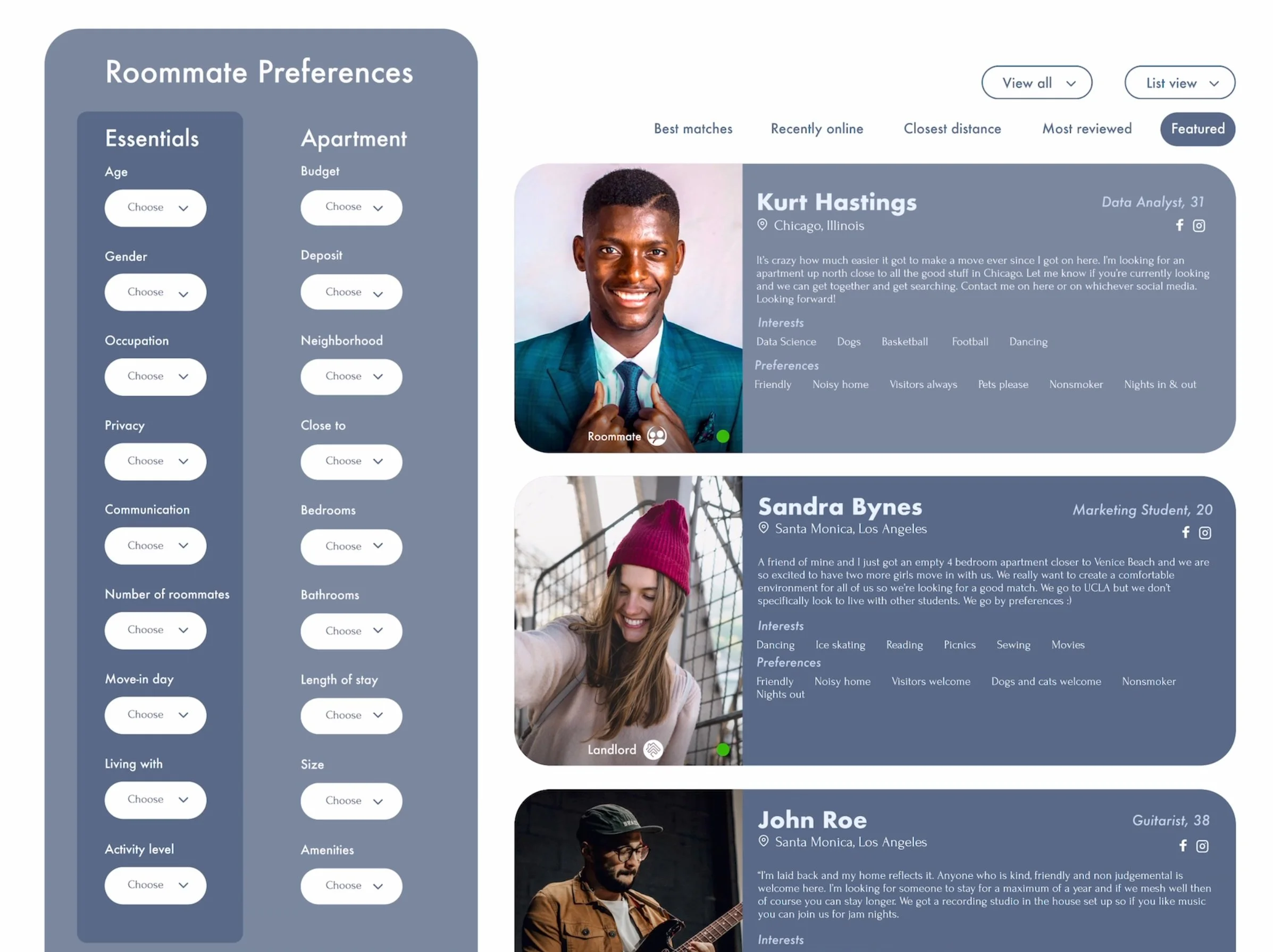
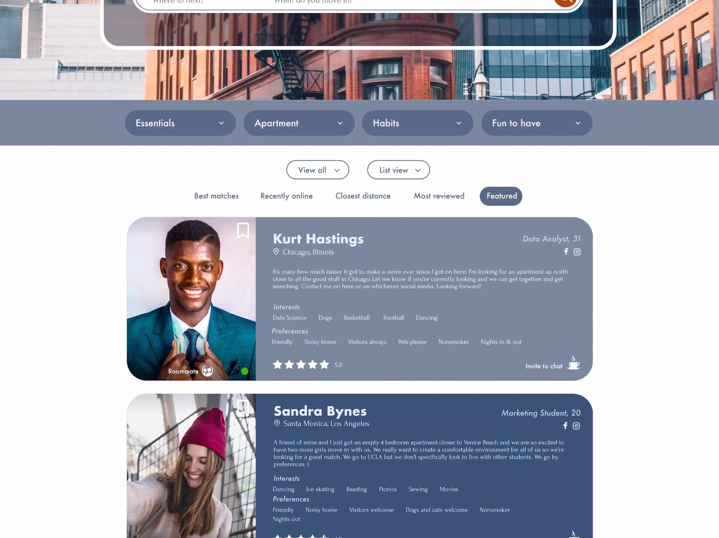
Initially, I wanted to accommodate users with the familiar experience of swiping for romance and friendships but for roommates. Though, for the purpose of finding roommates on the app and the time consumption it takes to swipe from person to person, it greatly limits the amount of information users can see when they are looking to optimize their time.
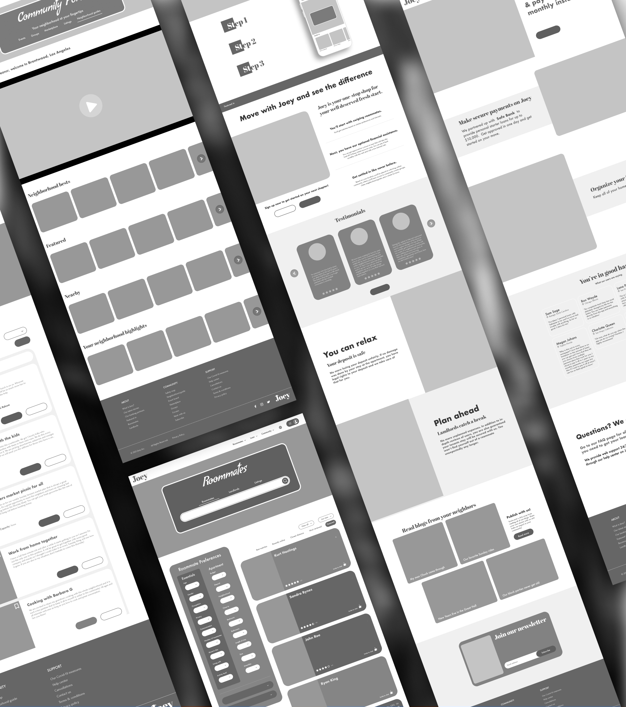
Here is a first look at some of the mid fidelity wireframes based on the initial landing page sketch.
We can see some of the feedback notes that I received in the process. Certain elements that I initially thought could be quirky additions were distracting. The reviews were misplaced without further explanation about what Joey does. The steps were taking too much space placed diagonally. There was too much text without breaks or anything eye catching so that the user could lose interest in those initial moments of stumbling on the website. Some elements that I initially wanted to put in because I considered them nostalgic were actually outdated and when placed, appeared unprofessional for the current market. These are the things that I wouldn’t have known had I not worked it into the design to begin with.


